Empowering Pregnancy Health Tracking with Insights and Habits
ROLE
Product Designer

DURATION
2 Weeks
TEAM
1 Product Manager
1 Product Designer
5 Engineers
Turning passive health logging into a personalized, insight-driven experience with visual trends and habit-building features that support daily engagement
Context
Momitalk is a pregnancy app designed to support expectant mothers with personalized tools and resources. One of its original features, My Weight, was created to help users track their weight during pregnancy. This project evolved the basic weight tracker into a comprehensive and habit-forming logging experience called My Health.
Problem
The initial logging feature, My Weight, operated as a simple input field, providing no feedback, context, or habit mechanisms. Users didn’t understand the value of tracking their weight within the app, so most logged their information only once or twice before dropping off.
Solution
I led the redesign of the health tracking feature, transforming it from a passive input tool into an insight-driven, habit-forming experience. Key changes included real-time health feedback, visual trend summaries, AI-powered guidance, and motivational features such as streaks and reminders.
Impact
The new logging feature increased user engagement and retention across key markets.
- 2x increase in feature adoption
- 3x growth in retention for logging
Discover
Why the Existing Logging Feature Wasn’t Working
Before redesigning the logging experience, I analyzed usage data from My Weight — the existing weight logging feature. Across all key markets, engagement was consistently low. 3–8% of users ever interacted with the feature, and, among those who logged their weight, weekly retention dropped below 10%. These numbers revealed that:
- Discovery was poor → Most users never found the feature
- Perceived value was low → Logging gave no feedback or insights
- Habit-building failed → Retention dropped after first log
From a product perspective, this feature was not just underperforming; it was fundamentally misaligned with user behavior and expectations. My challenge was not simply to improve the user interface, but to redesign the experience around behavioral reinforcement.

My Weight Usage Data across Markets
Behavioral Gaps in the Existing Experience
“What prevents expectant mothers from building a logging habit, and how can we help them succeed?” To answer this, I used Fogg’s Behavior Model to analyze user behavior around My Weight. This states that behavior happens when Motivation, Ability, and a Prompt converge. If any of them is missing, desired behavior is unlikely to happen.
A focused gap analysis revealed key breakdowns across all three components, explaining not just what was lacking, but why users failed to build a logging habit.
Breakdown
- Lack of Motivation: No value returned after logging
- Low Ability: Manual, isolated input with no context
- Missing Prompt: No reminders or in-app nudges
Design Opportunity
- Show insights, progress, and reassurance
- Simplify flow + include comprehensive logging
- Add streaks, triggers, and notifications
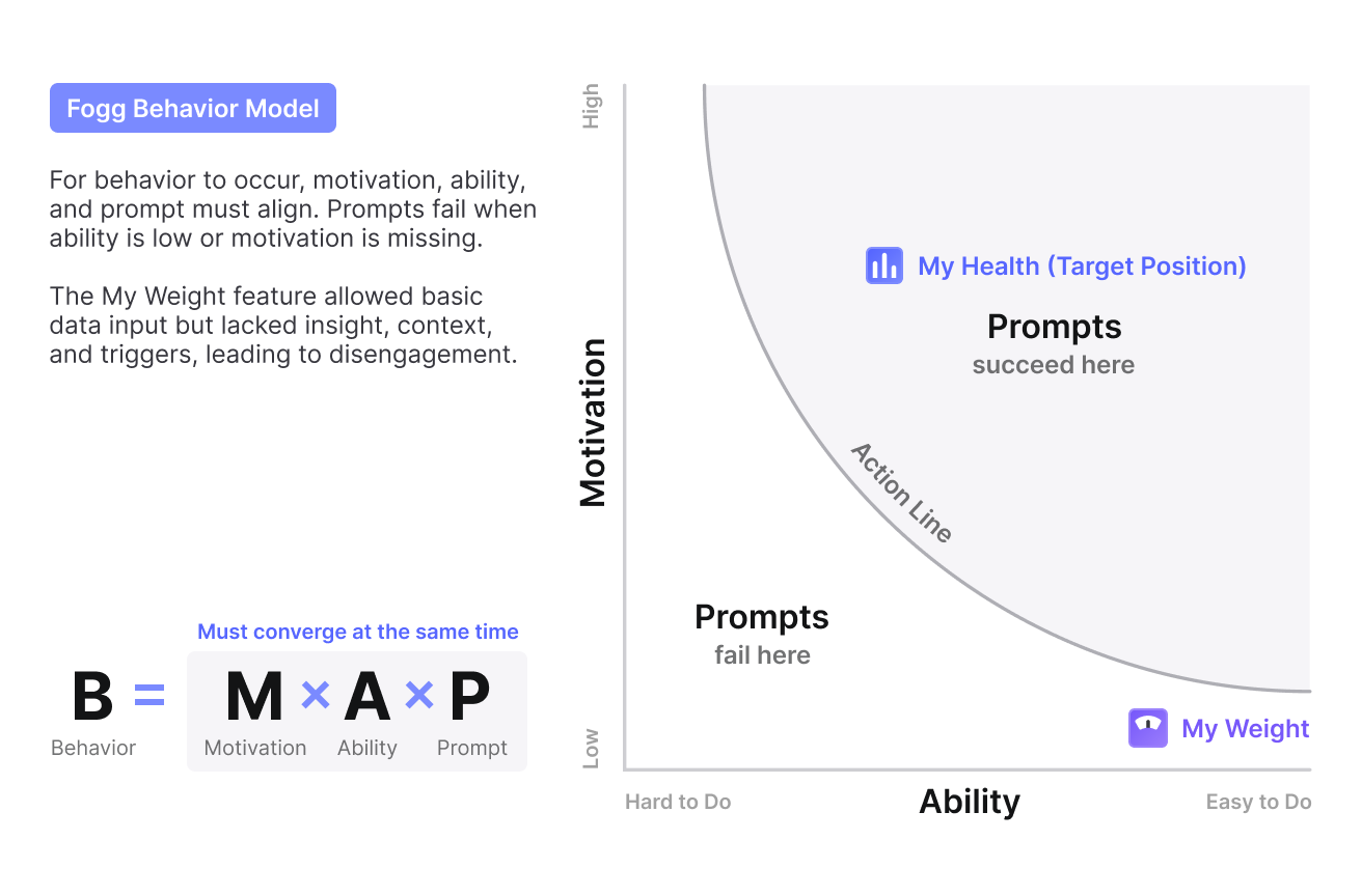
Fogg Behavior Model (B=MAP) Graph
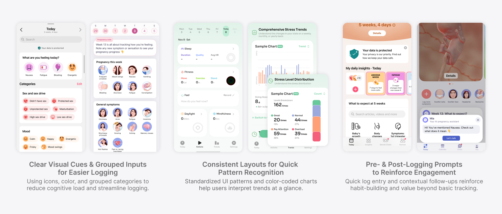
Comparative UX Patterns That Informed Strategy
To avoid reinventing the wheel, I conducted a focused comparative analysis of 6+ products across pregnancy, wellness, and symptom tracking apps. The goal wasn’t to copy features but to study interaction patterns that successfully encouraged repeat use. These patterns grounded our design in user behavior, not assumptions.
Key Patterns
- Quick, low-friction input → higher repeat use
- Visual or emotional feedback → stronger perceived value
- Streaks and in-context nudges → habit reinforcement
- Grouped inputs and icons → lower cognitive load
- Contextual follow-ups → increased retention after logging
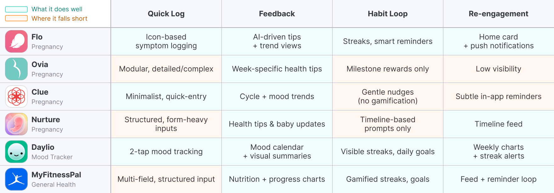
Comparative Analysis
What Users Actually Need to Build a Logging Habit
Through both user behavior data and comparative analysis, I synthesized 4 core user needs that would inform the redesign. These insights shaped how I defined and scoped the redesign strategy.
Key Insights
Users wanted to know if their data meant anything
Logging without feedback felt like a dead end. Without seeing if their weight was in a healthy range or improving over time, users lacked motivation to continue.
Even small friction points caused abandonment
Multi-step flows, disconnected inputs, or hard-to-interpret visuals created cognitive load. Users were more likely to drop off after a single failed attempt.
Motivation didn’t come from reminders, it came from momentum
Visual cues (streaks, badges, progress summaries) made users feel like they were getting somewhere. Those without feedback or payoff saw users disengage quickly.
Logging felt too isolated from the rest of their health journey
Tracking weight alone lacked context. Users couldn’t relate it to mood, symptoms, or what was expected at pregnancy stages, making the data feel abstract and unhelpful.
Define
Turning User Insights into Design Opportunities
The research highlighted that to increase retention and make logging sustainable, we needed to go beyond merely collecting data and focus on providing value to users at every step. I translated the four user needs into four strategic design opportunities to transform the logging feature from a simple utility into a supportive experience, one that users could rely on and emotionally invest in.
Key Opportunities
Make logging instantly meaningful
Logging needs to feel worth doing. Users should instantly see if their data falls within a healthy range or shows trend direction and progress.
Remove friction at every step
Cognitive load and input steps must be reduced. Quick, icon-based logging and digestible data visualization lower the barrier for daily use.
Build lightweight habit loops
Retention depends on feedback, not just reminders. Visual cues like streaks, trend indicators, and small wins create lightweight motivation to return.
Layer in context to add relevance
Users want to see their data in the context of their pregnancy journey. Including emotional and symptomatic tracking creates richer context and relevance.
Design Principles for Insightful, Habit-Building Tracking
To keep the design direction focused, I defined three principles rooted in behavioral UX patterns and our product KPIs. These principles are directly tied to the product’s success metrics, ensuring that the redesigned experience would provide holistic support to users by making logging easier, more valuable, and more sustainable.
Simplicity
Logging should take under 15 sec and data must be digestible.
Instant Value
Every log should trigger a moment of clarity, insight, or reassurance.
Motivation
Retention grows when users feel they’re making progress.
Ideate
Designing for Habit Formation, Not Just Usage
With the behavioral insights and product goals clearly defined, I used the Hooked Model to structure ideation, ensuring that each feature aligned with a habit-building loop rather than a one-time action. This framework helped prioritize not just what features to build, but when and why they should appear in the user journey.
To keep scope manageable and impact high, I used an Effort vs. Impact matrix to prioritize features. These formed the foundation of the MVP and drove the design explorations in the next phase.
Key Features
- Quick log on home screen
- Healthy range visual feedback
- Streak tracker + reminders
- Weekly summary cards
- AI insights
Reason
- Reduces friction and improves activation
- Builds value perception immediately
- Reinforces habit loop daily
- Sustains investment and reward over time
- Scales personalized value
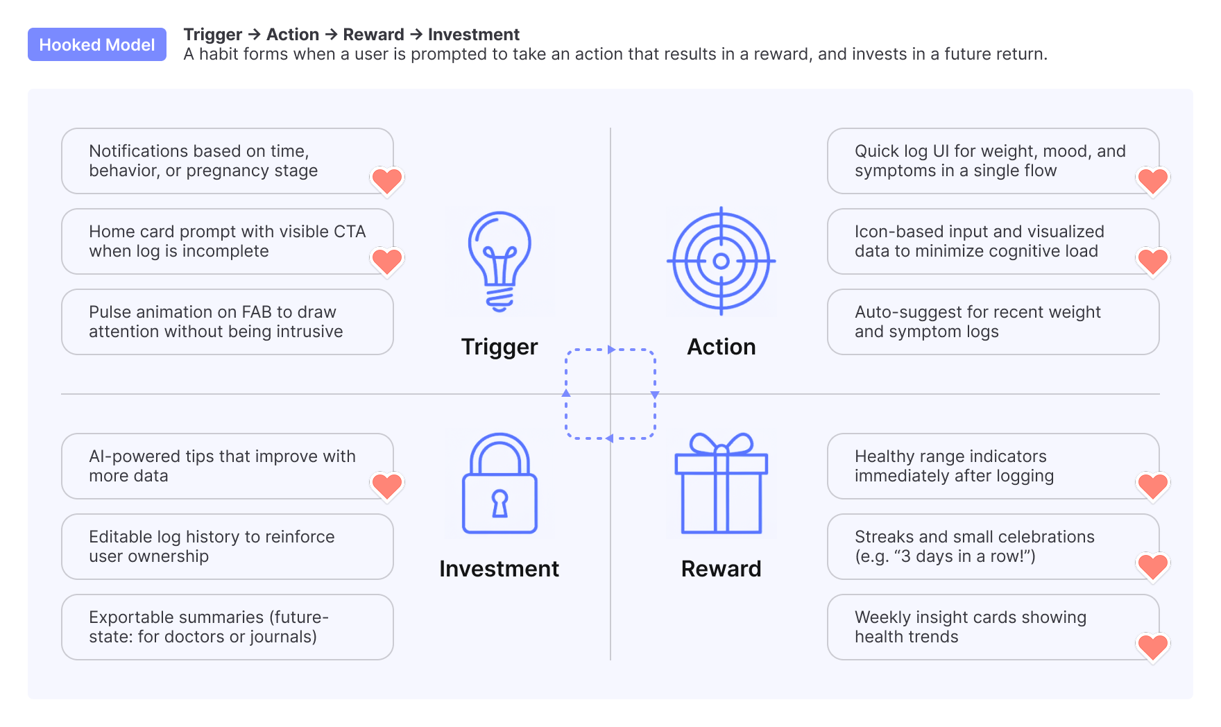
Ideation Guided by Hooked Model
Prototype
Making Health Insights Clear, Structured, and Motivating
The first design iteration focused on making health insights more digestible and engaging while reinforcing user motivation. To achieve this, I introduced streak tracking, weekly insights, and categorized logging cards, ensuring a seamless experience. Below is the key feedback from the team and the resulting design refinements.
Feedback Highlights
- Health insights lacked visibility: Key information was pushed below the fold, reducing engagement.
- Insights were difficult to scan: Users had to process multiple data points separately, making trends harder to recognize.
- Inconsistent UI components: The insight cards didn’t follow the app’s design system, affecting visual coherence.
Design Decisions
- Prioritized health insights above the fold: Reduced streak prominence and repositioned insights for immediate visibility.
- Improved scannability: Adjusted layout, typography, and spacing to make trends easily digestible at a glance.
- Standardized UI patterns: Applied consistent card designs to ensure clarity and alignment with the existing design system.
Refining Hierarchy and Visualization for Scannability
Building on insights from the initial iteration, this phase refined usability, improved hierarchy, and enhanced engagement by making health insights more structured and visually accessible. Below is the key feedback and design decisions made in response.
Feedback Highlights
- Top navigation occupied too much space: The title bar and progress elements limited the visibility of health insights.
- Inconsistent title bar design: The header didn’t follow UI system standards, creating inconsistency across the app.
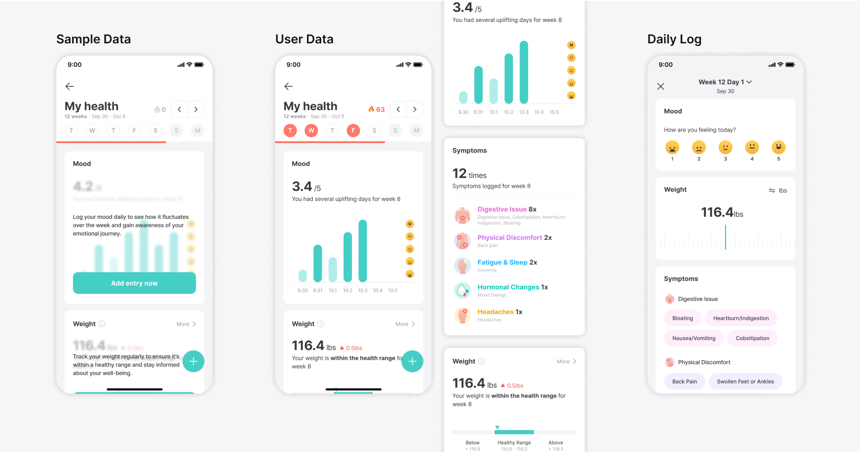
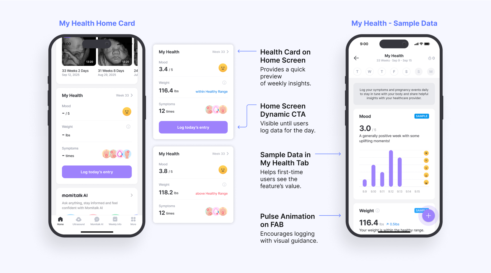
- Blurred sample data reduced engagement: The blur effect made it difficult for new users to see the feature’s value.
Design Decisions
- Optimized top navigation: Adopted design system components, reducing the header’s footprint to increase space for insights.
- Standardized title bar design: Ensured visual consistency across the app by aligning with existing UI patterns.
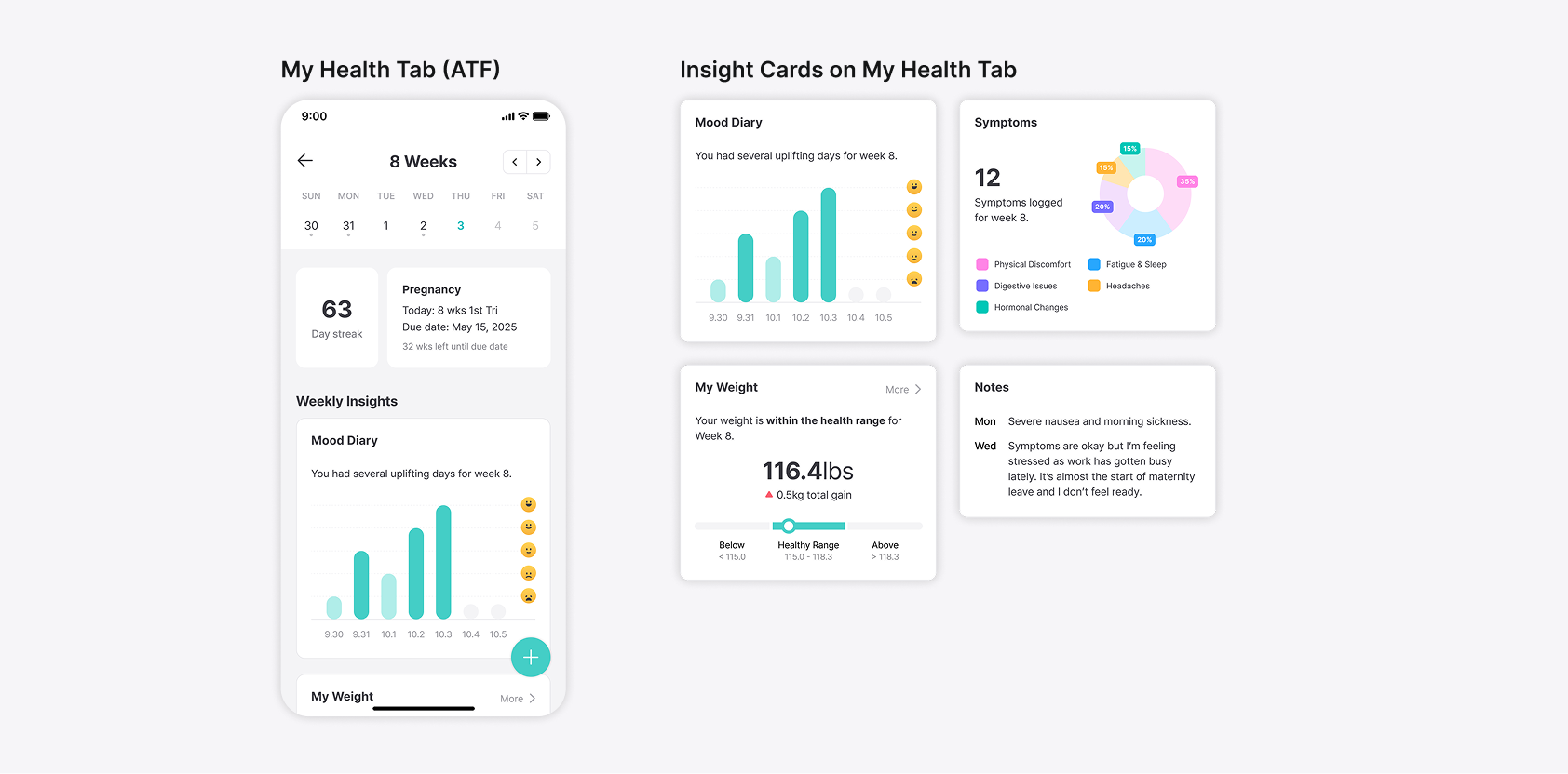
- Enhanced preview data visibility: Removed the blur effect, replacing it with clear sample data to encourage first-time logging.
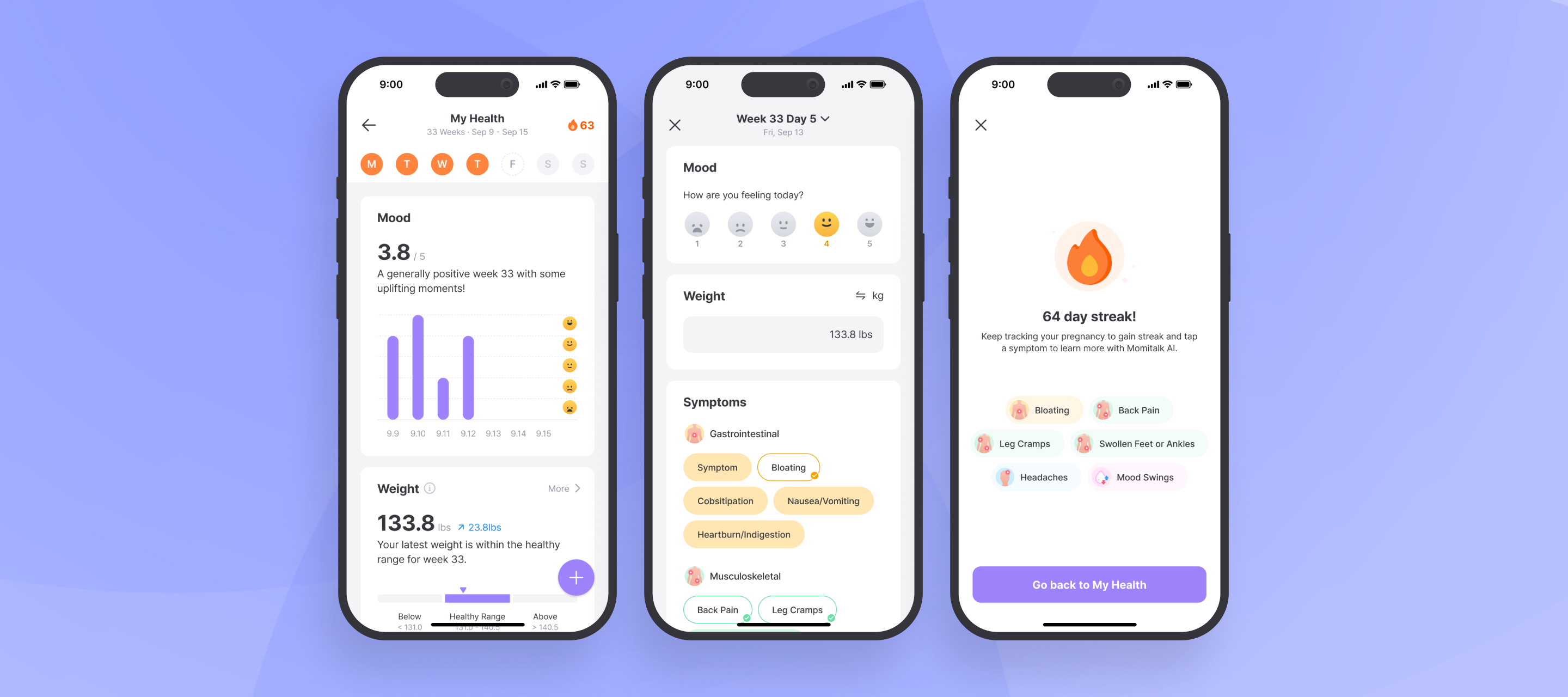
Deliver
Delivering a Logging Experience That Drives Behavior
Synthesizing insights from multiple design explorations, I delivered a habit-supporting, insight-driven experience that turned passive tracking into an active, rewarding behavior. The Key features include:
- Real-time feedback to help users understand whether their weight is within a healthy range.
- Clear visualizations for trend tracking across key symptoms and health categories.
- Guided engagement with visible CTAs, animations, and sample data to reduce friction.
- Motivational tools like streaks, AI insights, and timely reminders to encourage consistent use.
By improving clarity, delivering meaningful insights, and reinforcing habits, the new logging feature, My Health, helps expectant mothers feel informed and in control throughout their pregnancy.
Driving Adoption with Clear Guidance and Visual Cues
To make logging intuitive and lower the barrier to entry, I introduced clearer access points and visual cues that guide user behavior:
- A weekly insights preview and a CTA on the home screen encourage daily engagement.
- Sample data is shown to new users, demonstrating the feature’s value before first use.
- A subtle pulse animation on the FAB directs attention to the logging function within the tab.
These improve discoverability, reduce cognitive friction, and boost first-time and recurring use.
Empowering Expectant Moms with Visual Insights
To make health data actionable, I redesigned the insights display using consistent and meaningful visual elements:
- Unified card components, icons, and color cues make insights easier to scan and interpret.
- Health categories are organized to help users focus on what's most relevant.
- A redesigned weight tracking chart provides visual trends and benchmarks based on pregnancy progress and pre-pregnancy data.
This visual clarity supports informed decision-making and strengthens the user's sense of control over their health.
Reinforcing Daily Habits with AI and Motivation Tools
To build consistent tracking habits, I integrated features that combine motivation and reminders:
- Streak rewards gamify daily logging, encouraging continued engagement.
- AI insights provide context-specific guidance based on logged symptoms.
- Smart notifications remind users to log at the right moment without being intrusive.
These create a positive feedback loop that turns one-time actions into sustainable routines.
Measure
Higher Engagement and Retention
The revamped logging feature, My Health, significantly improved user engagement and retention across all regions. By introducing intuitive logging, habit-forming elements, and actionable insights, users were more likely to visit the My Health tab and complete logs consistently. These results validate the importance of seamless tracking, motivation-driven features, and clear health insights in driving long-term user adoption.
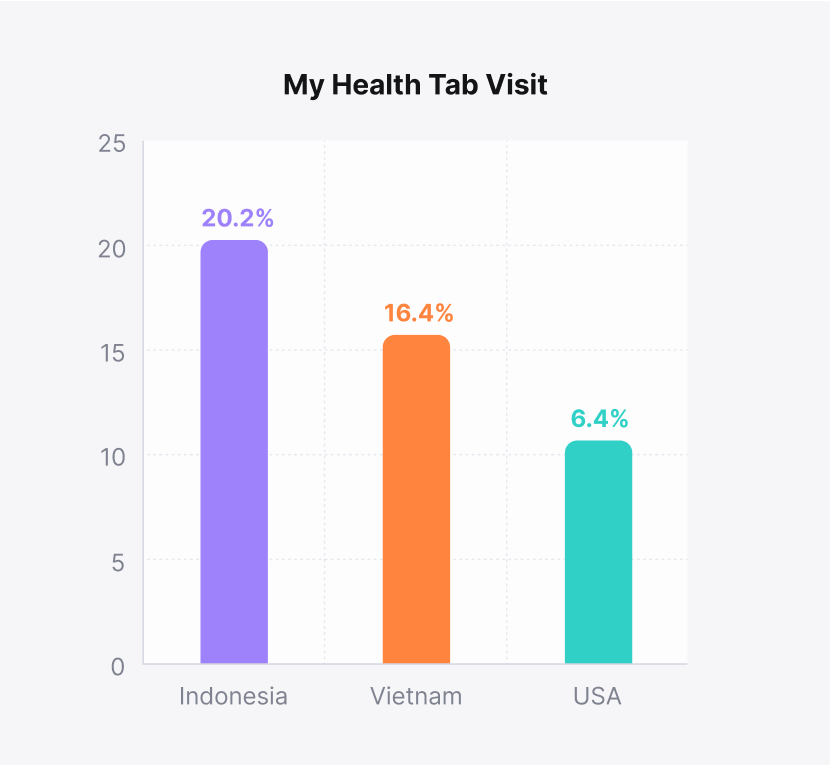
- Increased Feature Adoption: Indonesia (20.2%), Vietnam (16.4%), and the USA (6.4%) saw notable My Health tab visit rates.
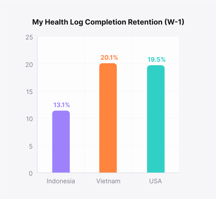
- Higher Retention for Logging: W-1 retention for completed logs showed strong engagement in Vietnam (20.1%), the USA (19.5%), and Indonesia (13.1%).
Reflect
Lessons Learned and Opportunities
The launch of My Health provided valuable insights into user engagement, market-specific adoption patterns, and opportunities for growth. While the feature successfully increased retention and engagement, regional differences highlighted areas for improvement. By analyzing user behavior, we identified key learnings that will inform future product iterations, strategies, and expansion efforts.
What Worked
Streamlined Engineering Collaboration
Collaborating with five engineers came with communication challenges, especially around complex data visualization. However, assigning a clear POC improved decision-making, reduced miscommunication, and accelerated project progress.
Areas to Improve
Market-Specific Retention Challenges
In the U.S., lower conversion stemmed from targeting later-stage pregnancies via ultrasound studios, making logging feel less relevant. Adjusting acquisition to reach earlier-stage users could boost adoption and engagement.
Next Opportunity
Closing the Retention Gap in Indonesia
While Indonesia had the highest screen visit rate, retention was comparatively lower. Further research is needed to identify factors contributing to drop-offs and improve sustained usage.
Empowering Pregnancy Health Tracking with Insights and Habits
ROLE
Product Designer

DURATION
2 Weeks
TEAM
1 Product Manager
1 Product Designer
5 Engineers
Turning passive health logging into a personalized, insight-driven experience with visual trends and habit-building features that support daily engagement
Context
Momitalk is a pregnancy app designed to support expectant mothers with personalized tools and resources. One of its original features, My Weight, was created to help users track their weight during pregnancy. This project evolved the basic weight tracker into a comprehensive and habit-forming logging experience called My Health.
Problem
The initial logging feature, My Weight, operated as a simple input field, providing no feedback, context, or habit mechanisms. Users didn’t understand the value of tracking their weight within the app, so most logged their information only once or twice before dropping off.
Solution
I led the redesign of the health tracking feature, transforming it from a passive input tool into an insight-driven, habit-forming experience. Key changes included real-time health feedback, visual trend summaries, AI-powered guidance, and motivational features such as streaks and reminders.
Impact
The new logging feature increased user engagement and retention across key markets.
- 2x increase in feature adoption
- 3x growth in retention for logging
Discover
Why the Existing Logging Feature Wasn’t Working
Before redesigning the logging experience, I analyzed usage data from My Weight — the existing weight logging feature. Across all key markets, engagement was consistently low. 3–8% of users ever interacted with the feature, and, among those who logged their weight, weekly retention dropped below 10%. These numbers revealed that:
- Discovery was poor → Most users never found the feature
- Perceived value was low → Logging gave no feedback or insights
- Habit-building failed → Retention dropped after first log
From a product perspective, this feature was not just underperforming; it was fundamentally misaligned with user behavior and expectations. My challenge was not simply to improve the user interface, but to redesign the experience around behavioral reinforcement.
My Weight Usage Data across Markets
Behavioral Gaps in the Existing Experience
“What prevents expectant mothers from building a logging habit, and how can we help them succeed?” To answer this, I used Fogg’s Behavior Model to analyze user behavior around My Weight. This states that behavior happens when Motivation, Ability, and a Prompt converge. If any of them is missing, desired behavior is unlikely to happen.
A focused gap analysis revealed key breakdowns across all three components, explaining not just what was lacking, but why users failed to build a logging habit.
Breakdown
- Lack of Motivation: No value returned after logging
- Low Ability: Manual, isolated input with no context
- Missing Prompt: No reminders or in-app nudges
Design Opportunity
- Show insights, progress, and reassurance
- Simplify flow + include comprehensive logging
- Add streaks, triggers, and notifications
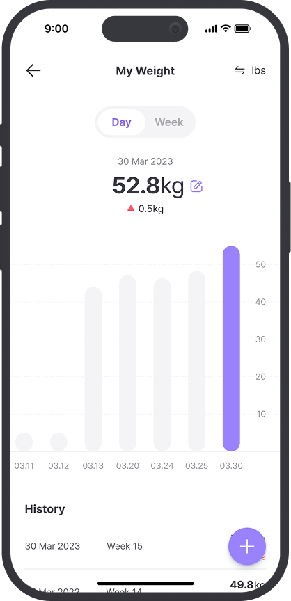
My Weight
Fogg Behavior Model (B=MAP) Graph
Comparative UX Patterns That Informed Strategy
To avoid reinventing the wheel, I conducted a focused comparative analysis of 6+ products across pregnancy, wellness, and symptom tracking apps. The goal wasn’t to copy features but to study interaction patterns that successfully encouraged repeat use. These patterns grounded our design in user behavior, not assumptions.
Key Patterns
- Quick, low-friction input → higher repeat use
- Visual or emotional feedback → stronger perceived value
- Streaks and in-context nudges → habit reinforcement
- Grouped inputs and icons → lower cognitive load
- Contextual follow-ups → increased retention after logging
Comparative Analysis
What Users Actually Need to Build a Logging Habit
Through both user behavior data and comparative analysis, I synthesized 4 core user needs that would inform the redesign. These insights shaped how I defined and scoped the redesign strategy.
Key Insights
Users wanted to know if their data meant anything
Logging without feedback felt like a dead end. Without seeing if their weight was in a healthy range or improving over time, users lacked motivation to continue.
Even small friction points caused abandonment
Multi-step flows, disconnected inputs, or hard-to-interpret visuals created cognitive load. Users were more likely to drop off after a single failed attempt.
Motivation didn’t come from reminders, it came from momentum
Visual cues (streaks, badges, progress summaries) made users feel like they were getting somewhere. Those without feedback or payoff saw users disengage quickly.
Logging felt too isolated from the rest of their health journey
Tracking weight alone lacked context. Users couldn’t relate it to mood, symptoms, or what was expected at pregnancy stages, making the data feel abstract and unhelpful.
Define
Turning User Insights into Design Opportunities
The research highlighted that to increase retention and make logging sustainable, we needed to go beyond merely collecting data and focus on providing value to users at every step. I translated the four user needs into four strategic design opportunities to transform the logging feature from a simple utility into a supportive experience, one that users could rely on and emotionally invest in.
Key Opportunities
Make logging instantly meaningful
Logging needs to feel worth doing. Users should instantly see if their data falls within a healthy range or shows trend direction and progress.
Remove friction at every step
Cognitive load and input steps must be reduced. Quick, icon-based logging and digestible data visualization lower the barrier for daily use.
Build lightweight habit loops
Retention depends on feedback, not just reminders. Visual cues like streaks, trend indicators, and small wins create lightweight motivation to return.
Layer in context to add relevance
Users want to see their data in the context of their pregnancy journey. Including emotional and symptomatic tracking creates richer context and relevance.
Design Principles for Insightful, Habit-Building Tracking
To keep the design direction focused, I defined three principles rooted in behavioral UX patterns and our product KPIs. These principles are directly tied to the product’s success metrics, ensuring that the redesigned experience would provide holistic support to users by making logging easier, more valuable, and more sustainable.
Simplicity
Logging should take under 15 sec and data must be digestible.
Instant Value
Every log should trigger a moment of clarity, insight, or reassurance.
Motivation
Retention grows when users feel they’re making progress.
Ideate
Designing for Habit Formation, Not Just Usage
With the behavioral insights and product goals clearly defined, I used the Hooked Model to structure ideation, ensuring that each feature aligned with a habit-building loop rather than a one-time action. This framework helped prioritize not just what features to build, but when and why they should appear in the user journey.
To keep scope manageable and impact high, I used an Effort vs. Impact matrix to prioritize features. These formed the foundation of the MVP and drove the design explorations in the next phase.
Key Features
- Quick log on home screen
- Healthy range visual feedback
- Streak tracker + reminders
- Weekly summary cards
- AI insights
Reason
- Reduces friction and improves activation
- Builds value perception immediately
- Reinforces habit loop daily
- Sustains investment and reward over time
- Scales personalized value
Ideation Guided by Hooked Model
Prototype
Making Health Insights Clear, Structured, and Motivating
The first design iteration focused on making health insights more digestible and engaging while reinforcing user motivation. To achieve this, I introduced streak tracking, weekly insights, and categorized logging cards, ensuring a seamless experience. Below is the key feedback from the team and the resulting design refinements.
Feedback Highlights
- Health insights lacked visibility: Key information was pushed below the fold, reducing engagement.
- Insights were difficult to scan: Users had to process multiple data points separately, making trends harder to recognize.
- Inconsistent UI components: The insight cards didn’t follow the app’s design system, affecting visual coherence.
Design Decisions
- Prioritized health insights above the fold: Reduced streak prominence and repositioned insights for immediate visibility.
- Improved scannability: Adjusted layout, typography, and spacing to make trends easily digestible at a glance.
- Standardized UI patterns: Applied consistent card designs to ensure clarity and alignment with the existing design system.
Refining Hierarchy and Visualization for Scannability
Building on insights from the initial iteration, this phase refined usability, improved hierarchy, and enhanced engagement by making health insights more structured and visually accessible. Below is the key feedback and design decisions made in response.
Feedback Highlights
- Top navigation occupied too much space: The title bar and progress elements limited the visibility of health insights.
- Inconsistent title bar design: The header didn’t follow UI system standards, creating inconsistency across the app.
- Blurred sample data reduced engagement: The blur effect made it difficult for new users to see the feature’s value.
Design Decisions
- Optimized top navigation: Adopted design system components, reducing the header’s footprint to increase space for insights.
- Standardized title bar design: Ensured visual consistency across the app by aligning with existing UI patterns.
- Enhanced preview data visibility: Removed the blur effect, replacing it with clear sample data to encourage first-time logging.
Deliver
Delivering a Logging Experience That Drives Behavior
Synthesizing insights from multiple design explorations, I delivered a habit-supporting, insight-driven experience that turned passive tracking into an active, rewarding behavior. The Key features include:
- Real-time feedback to help users understand whether their weight is within a healthy range.
- Clear visualizations for trend tracking across key symptoms and health categories.
- Guided engagement with visible CTAs, animations, and sample data to reduce friction.
- Motivational tools like streaks, AI insights, and timely reminders to encourage consistent use.
By improving clarity, delivering meaningful insights, and reinforcing habits, the new logging feature, My Health, helps expectant mothers feel informed and in control throughout their pregnancy.
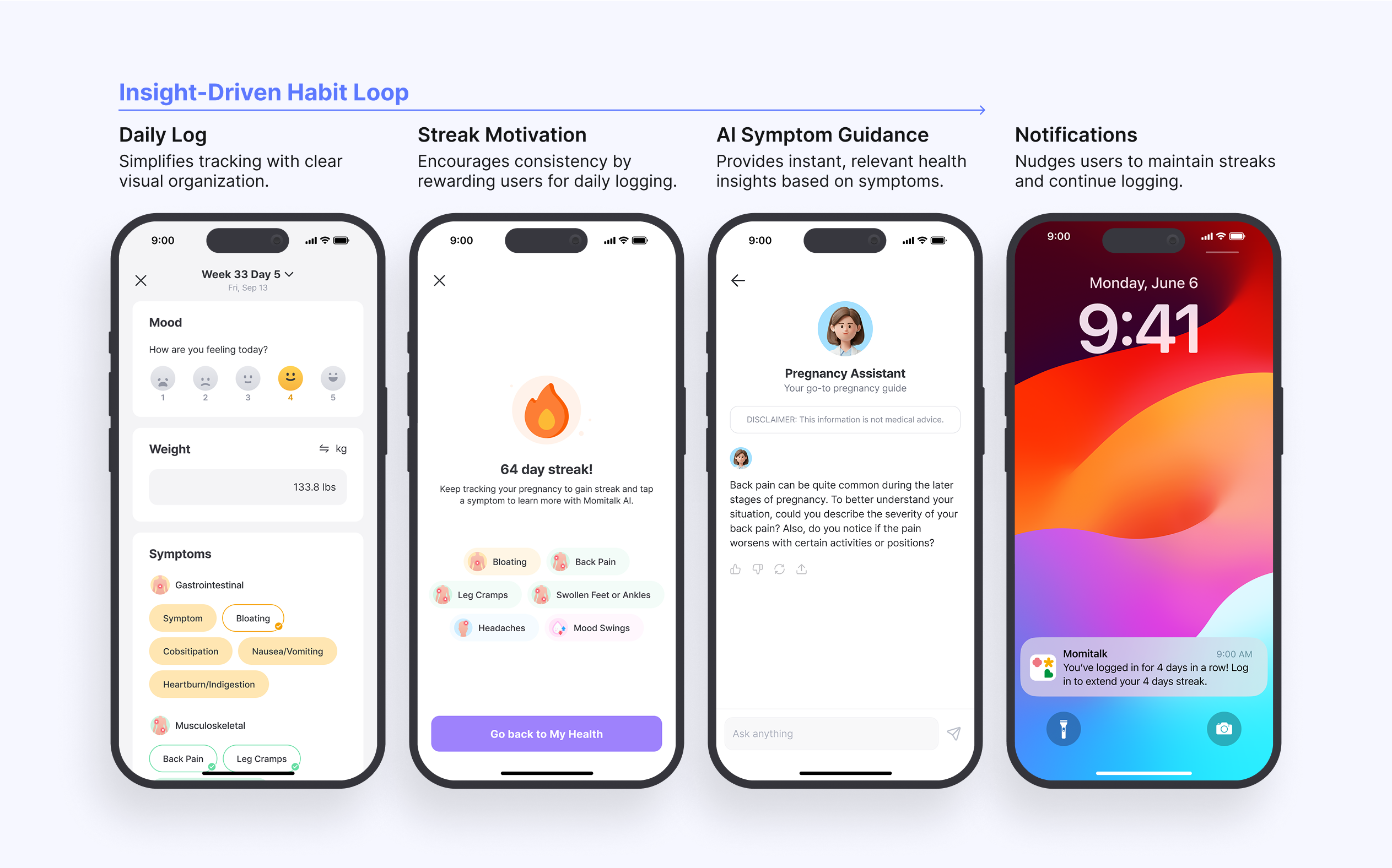
Driving Adoption with Clear Guidance and Visual Cues
To make logging intuitive and lower the barrier to entry, I introduced clearer access points and visual cues that guide user behavior:
- A weekly insights preview and a CTA on the home screen encourage daily engagement.
- Sample data is shown to new users, demonstrating the feature’s value before first use.
- A subtle pulse animation on the FAB directs attention to the logging function within the tab.
These improve discoverability, reduce cognitive friction, and boost first-time and recurring use.
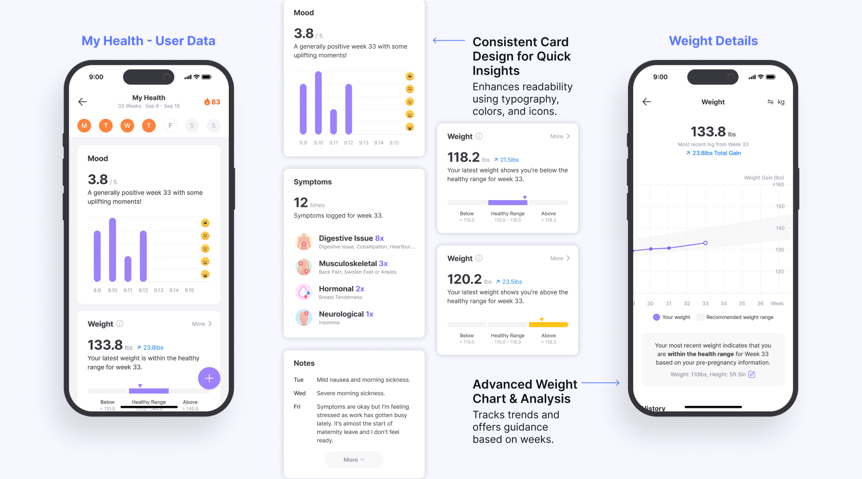
Empowering Expectant Moms with Visual Insights
To make health data actionable, I redesigned the insights display using consistent and meaningful visual elements:
- Unified card components, icons, and color cues make insights easier to scan and interpret.
- Health categories are organized to help users focus on what's most relevant.
- A redesigned weight tracking chart provides visual trends and benchmarks based on pregnancy progress and pre-pregnancy data.
This visual clarity supports informed decision-making and strengthens the user's sense of control over their health.
Reinforcing Daily Habits with AI and Motivation Tools
To build consistent tracking habits, I integrated features that combine motivation and reminders:
- Streak rewards gamify daily logging, encouraging continued engagement.
- AI insights provide context-specific guidance based on logged symptoms.
- Smart notifications remind users to log at the right moment without being intrusive.
These create a positive feedback loop that turns one-time actions into sustainable routines.
Measure
Higher Engagement and Retention
The revamped logging feature, My Health, significantly improved user engagement and retention across all regions. By introducing intuitive logging, habit-forming elements, and actionable insights, users were more likely to visit the My Health tab and complete logs consistently. These results validate the importance of seamless tracking, motivation-driven features, and clear health insights in driving long-term user adoption.
- Increased Feature Adoption: Indonesia (20.2%), Vietnam (16.4%), and the USA (6.4%) saw notable My Health tab visit rates.
- Higher Retention for Logging: W-1 retention for completed logs showed strong engagement in Vietnam (20.1%), the USA (19.5%), and Indonesia (13.1%).
Reflect
Lessons Learned and Opportunities
The launch of My Health provided valuable insights into user engagement, market-specific adoption patterns, and opportunities for growth. While the feature successfully increased retention and engagement, regional differences highlighted areas for improvement. By analyzing user behavior, we identified key learnings that will inform future product iterations, strategies, and expansion efforts.
What Worked
Streamlined Engineering Collaboration
Collaborating with five engineers came with communication challenges, especially around complex data visualization. However, assigning a clear POC improved decision-making, reduced miscommunication, and accelerated project progress.
Areas to Improve
Market-Specific Retention Challenges
In the U.S., lower conversion stemmed from targeting later-stage pregnancies via ultrasound studios, making logging feel less relevant. Adjusting acquisition to reach earlier-stage users could boost adoption and engagement.
Next Opportunity
Closing the Retention Gap in Indonesia
While Indonesia had the highest screen visit rate, retention was comparatively lower. Further research is needed to identify factors contributing to drop-offs and improve sustained usage.
Empowering Pregnancy Health Tracking with Insights and Habits
ROLE
Product Designer

DURATION
2 Weeks
TEAM
1 Product Manager
1 Product Designer
5 Engineers
Turning passive health logging into a personalized, insight-driven experience with visual trends and habit-building features that support daily engagement
Context
Momitalk is a pregnancy app designed to support expectant mothers with personalized tools and resources. One of its original features, My Weight, was created to help users track their weight during pregnancy. This project evolved the basic weight tracker into a comprehensive and habit-forming logging experience called My Health.
Problem
The initial logging feature, My Weight, operated as a simple input field, providing no feedback, context, or habit mechanisms. Users didn’t understand the value of tracking their weight within the app, so most logged their information only once or twice before dropping off.
Solution
I led the redesign of the health tracking feature, transforming it from a passive input tool into an insight-driven, habit-forming experience. Key changes included real-time health feedback, visual trend summaries, AI-powered guidance, and motivational features such as streaks and reminders.
Impact
The new logging feature increased user engagement and retention across key markets.
- 2x increase in feature adoption
- 3x growth in retention for logging
Discover
Why the Existing Logging Feature Wasn’t Working
Before redesigning the logging experience, I analyzed usage data from My Weight — the existing weight logging feature. Across all key markets, engagement was consistently low. 3–8% of users ever interacted with the feature, and, among those who logged their weight, weekly retention dropped below 10%. These numbers revealed that:
- Discovery was poor → Most users never found the feature
- Perceived value was low → Logging gave no feedback or insights
- Habit-building failed → Retention dropped after first log
From a product perspective, this feature was not just underperforming; it was fundamentally misaligned with user behavior and expectations. My challenge was not simply to improve the user interface, but to redesign the experience around behavioral reinforcement.
My Weight Usage Data across Markets
Behavioral Gaps in the Existing Experience
“What prevents expectant mothers from building a logging habit, and how can we help them succeed?” To answer this, I used Fogg’s Behavior Model to analyze user behavior around My Weight. This states that behavior happens when Motivation, Ability, and a Prompt converge. If any of them is missing, desired behavior is unlikely to happen.
A focused gap analysis revealed key breakdowns across all three components, explaining not just what was lacking, but why users failed to build a logging habit.
Breakdown
- Lack of Motivation: No value returned after logging
- Low Ability: Manual, isolated input with no context
- Missing Prompt: No reminders or in-app nudges
Design Opportunity
- Show insights, progress, and reassurance
- Simplify flow + include comprehensive logging
- Add streaks, triggers, and notifications
My Weight
Fogg Behavior Model (B=MAP) Graph
Comparative UX Patterns That Informed Strategy
To avoid reinventing the wheel, I conducted a focused comparative analysis of 6+ products across pregnancy, wellness, and symptom tracking apps. The goal wasn’t to copy features but to study interaction patterns that successfully encouraged repeat use. These patterns grounded our design in user behavior, not assumptions.
Key Patterns
- Quick, low-friction input → higher repeat use
- Visual or emotional feedback → stronger perceived value
- Streaks and in-context nudges → habit reinforcement
- Grouped inputs and icons → lower cognitive load
- Contextual follow-ups → increased retention after logging
Comparative Analysis
What Users Actually Need to Build a Logging Habit
Through both user behavior data and comparative analysis, I synthesized 4 core user needs that would inform the redesign. These insights shaped how I defined and scoped the redesign strategy.
Key Insights
Users wanted to know if their data meant anything
Logging without feedback felt like a dead end. Without seeing if their weight was in a healthy range or improving over time, users lacked motivation to continue.
Even small friction points caused abandonment
Multi-step flows, disconnected inputs, or hard-to-interpret visuals created cognitive load. Users were more likely to drop off after a single failed attempt.
Motivation didn’t come from reminders, it came from momentum
Visual cues (streaks, badges, progress summaries) made users feel like they were getting somewhere. Those without feedback or payoff saw users disengage quickly.
Logging felt too isolated from the rest of their health journey
Tracking weight alone lacked context. Users couldn’t relate it to mood, symptoms, or what was expected at pregnancy stages, making the data feel abstract and unhelpful.
Define
Turning User Insights into Design Opportunities
The research highlighted that to increase retention and make logging sustainable, we needed to go beyond merely collecting data and focus on providing value to users at every step. I translated the four user needs into four strategic design opportunities to transform the logging feature from a simple utility into a supportive experience, one that users could rely on and emotionally invest in.
Key Opportunities
Make logging instantly meaningful
Logging needs to feel worth doing. Users should instantly see if their data falls within a healthy range or shows trend direction and progress.
Remove friction at every step
Cognitive load and input steps must be reduced. Quick, icon-based logging and digestible data visualization lower the barrier for daily use.
Build lightweight habit loops
Retention depends on feedback, not just reminders. Visual cues like streaks, trend indicators, and small wins create lightweight motivation to return.
Layer in context to add relevance
Users want to see their data in the context of their pregnancy journey. Including emotional and symptomatic tracking creates richer context and relevance.
Design Principles for Insightful, Habit-Building Tracking
To keep the design direction focused, I defined three principles rooted in behavioral UX patterns and our product KPIs. These principles are directly tied to the product’s success metrics, ensuring that the redesigned experience would provide holistic support to users by making logging easier, more valuable, and more sustainable.
Simplicity
Logging should take under 15 sec and data must be digestible.
Instant Value
Every log should trigger a moment of clarity, insight, or reassurance.
Motivation
Retention grows when users feel they’re making progress.
Ideate
Designing for Habit Formation, Not Just Usage
With the behavioral insights and product goals clearly defined, I used the Hooked Model to structure ideation, ensuring that each feature aligned with a habit-building loop rather than a one-time action. This framework helped prioritize not just what features to build, but when and why they should appear in the user journey.
To keep scope manageable and impact high, I used an Effort vs. Impact matrix to prioritize features. These formed the foundation of the MVP and drove the design explorations in the next phase.
Key Features
- Quick log on home screen
- Healthy range visual feedback
- Streak tracker + reminders
- Weekly summary cards
- AI insights
Reason
- Reduces friction and improves activation
- Builds value perception immediately
- Reinforces habit loop daily
- Sustains investment and reward over time
- Scales personalized value
Ideation Guided by Hooked Model
Prototype
Making Health Insights Clear, Structured, and Motivating
The first design iteration focused on making health insights more digestible and engaging while reinforcing user motivation. To achieve this, I introduced streak tracking, weekly insights, and categorized logging cards, ensuring a seamless experience. Below is the key feedback from the team and the resulting design refinements.
Feedback Highlights
- Health insights lacked visibility: Key information was pushed below the fold, reducing engagement.
- Insights were difficult to scan: Users had to process multiple data points separately, making trends harder to recognize.
- Inconsistent UI components: The insight cards didn’t follow the app’s design system, affecting visual coherence.
Design Decisions
- Prioritized health insights above the fold: Reduced streak prominence and repositioned insights for immediate visibility.
- Improved scannability: Adjusted layout, typography, and spacing to make trends easily digestible at a glance.
- Standardized UI patterns: Applied consistent card designs to ensure clarity and alignment with the existing design system.
Refining Hierarchy and Visualization for Scannability
Building on insights from the initial iteration, this phase refined usability, improved hierarchy, and enhanced engagement by making health insights more structured and visually accessible. Below is the key feedback and design decisions made in response.
Feedback Highlights
- Top navigation occupied too much space: The title bar and progress elements limited the visibility of health insights.
- Inconsistent title bar design: The header didn’t follow UI system standards, creating inconsistency across the app.
- Blurred sample data reduced engagement: The blur effect made it difficult for new users to see the feature’s value.
Design Decisions
- Optimized top navigation: Adopted design system components, reducing the header’s footprint to increase space for insights.
- Standardized title bar design: Ensured visual consistency across the app by aligning with existing UI patterns.
- Enhanced preview data visibility: Removed the blur effect, replacing it with clear sample data to encourage first-time logging.
Deliver
Delivering a Logging Experience That Drives Behavior
Synthesizing insights from multiple design explorations, I delivered a habit-supporting, insight-driven experience that turned passive tracking into an active, rewarding behavior. The Key features include:
- Real-time feedback to help users understand whether their weight is within a healthy range.
- Clear visualizations for trend tracking across key symptoms and health categories.
- Guided engagement with visible CTAs, animations, and sample data to reduce friction.
- Motivational tools like streaks, AI insights, and timely reminders to encourage consistent use.
By improving clarity, delivering meaningful insights, and reinforcing habits, the new logging feature, My Health, helps expectant mothers feel informed and in control throughout their pregnancy.
Driving Adoption with Clear Guidance and Visual Cues
To make logging intuitive and lower the barrier to entry, I introduced clearer access points and visual cues that guide user behavior:
- A weekly insights preview and a CTA on the home screen encourage daily engagement.
- Sample data is shown to new users, demonstrating the feature’s value before first use.
- A subtle pulse animation on the FAB directs attention to the logging function within the tab.
These improve discoverability, reduce cognitive friction, and boost first-time and recurring use.
Empowering Expectant Moms with Visual Insights
To make health data actionable, I redesigned the insights display using consistent and meaningful visual elements:
- Unified card components, icons, and color cues make insights easier to scan and interpret.
- Health categories are organized to help users focus on what's most relevant.
- A redesigned weight tracking chart provides visual trends and benchmarks based on pregnancy progress and pre-pregnancy data.
This visual clarity supports informed decision-making and strengthens the user's sense of control over their health.
Reinforcing Daily Habits with AI and Motivation Tools
To build consistent tracking habits, I integrated features that combine motivation and reminders:
- Streak rewards gamify daily logging, encouraging continued engagement.
- AI insights provide context-specific guidance based on logged symptoms.
- Smart notifications remind users to log at the right moment without being intrusive.
These create a positive feedback loop that turns one-time actions into sustainable routines.
Measure
Higher Engagement and Retention
The revamped logging feature, My Health, significantly improved user engagement and retention across all regions. By introducing intuitive logging, habit-forming elements, and actionable insights, users were more likely to visit the My Health tab and complete logs consistently. These results validate the importance of seamless tracking, motivation-driven features, and clear health insights in driving long-term user adoption.
- Increased Feature Adoption: Indonesia (20.2%), Vietnam (16.4%), and the USA (6.4%) saw notable My Health tab visit rates.
- Higher Retention for Logging: W-1 retention for completed logs showed strong engagement in Vietnam (20.1%), the USA (19.5%), and Indonesia (13.1%).
Reflect
Lessons Learned and Opportunities
The launch of My Health provided valuable insights into user engagement, market-specific adoption patterns, and opportunities for growth. While the feature successfully increased retention and engagement, regional differences highlighted areas for improvement. By analyzing user behavior, we identified key learnings that will inform future product iterations, strategies, and expansion efforts.
What Worked
Streamlined Engineering Collaboration
Collaborating with five engineers came with communication challenges, especially around complex data visualization. However, assigning a clear POC improved decision-making, reduced miscommunication, and accelerated project progress.
Areas to Improve
Market-Specific Retention Challenges
In the U.S., lower conversion stemmed from targeting later-stage pregnancies via ultrasound studios, making logging feel less relevant. Adjusting acquisition to reach earlier-stage users could boost adoption and engagement.
Next Opportunity
Closing the Retention Gap in Indonesia
While Indonesia had the highest screen visit rate, retention was comparatively lower. Further research is needed to identify factors contributing to drop-offs and improve sustained usage.