Streamlining Family Invitations for Clarity and Connection
ROLE
Product Designer

DURATION
1 Week
TEAM
1 Product Manager
1 Product Designer
2 Engineers
Redesigning invitation and profile flows to help expectant families connect faster through fewer steps, clearer access levels, and easier collaboration
Context
Momitalk is a pregnancy support app that helps expecting parents stay informed and connected. As the platform expanded, supporting shared experiences across family members became critical to increasing user engagement and delivering value beyond the primary user. Family features, including invitations and profile controls, emerged as key touchpoints for emotional support and collaborative care during pregnancy.
Problem
The original family invitation flow was hard to find, overly complex, and unclear about user roles and access levels. This caused confusion among users, limited adoption of collaborative features, and generated high volumes of support tickets, negatively impacting both user satisfaction and clinical partner operations.
Solution
I led the redesign of the family invitation and profile management experience, repositioning it around simplicity, clarity, and discoverability. By restructuring navigation, clarifying access roles, and reducing friction across key flows, the experience became easier for families to understand and use, especially for first-time users.
Impact
The redesign doubled the number of accepted invitations in the first month post-launch and significantly reduced support inquiries. This strengthened family engagement, eased the burden on partner clinics, and laid the groundwork for future scalability in multi-member, multi-child households.
Discover
Uncovering Barriers in the Family Invitation Experience
By analyzing user behavior, feedback, and partner concerns, I uncovered key pain points that hindered usability and engagement. These issues included difficulty navigating the app, disruptions to partner workflows, and low conversion rates, all of which required a streamlined solution. Addressing these pain points presented a clear opportunity to simplify processes, clarify access levels, and improve overall user satisfaction.
User
Pain Point
A buried and complicated invitation flow reduced usability, and restricted roles made key features like ultrasounds inaccessible.
Opportunity
Simplifying the invitation process and clarifying access roles can improve user satisfaction.
Stakeholder
Pain Point
Frequent inquiries from users about adding family members disrupted clinic and hospital workflows, limiting their focus on core services.
Opportunity
Streamlining the family addition process can reduce the administrative burden on partners.
Business
Pain Point
Low family conversion rates and limited engagement impacted retention and app effectiveness.
Opportunity
Improving these flows can boost retention and increase engagement, fostering a seamless experience.
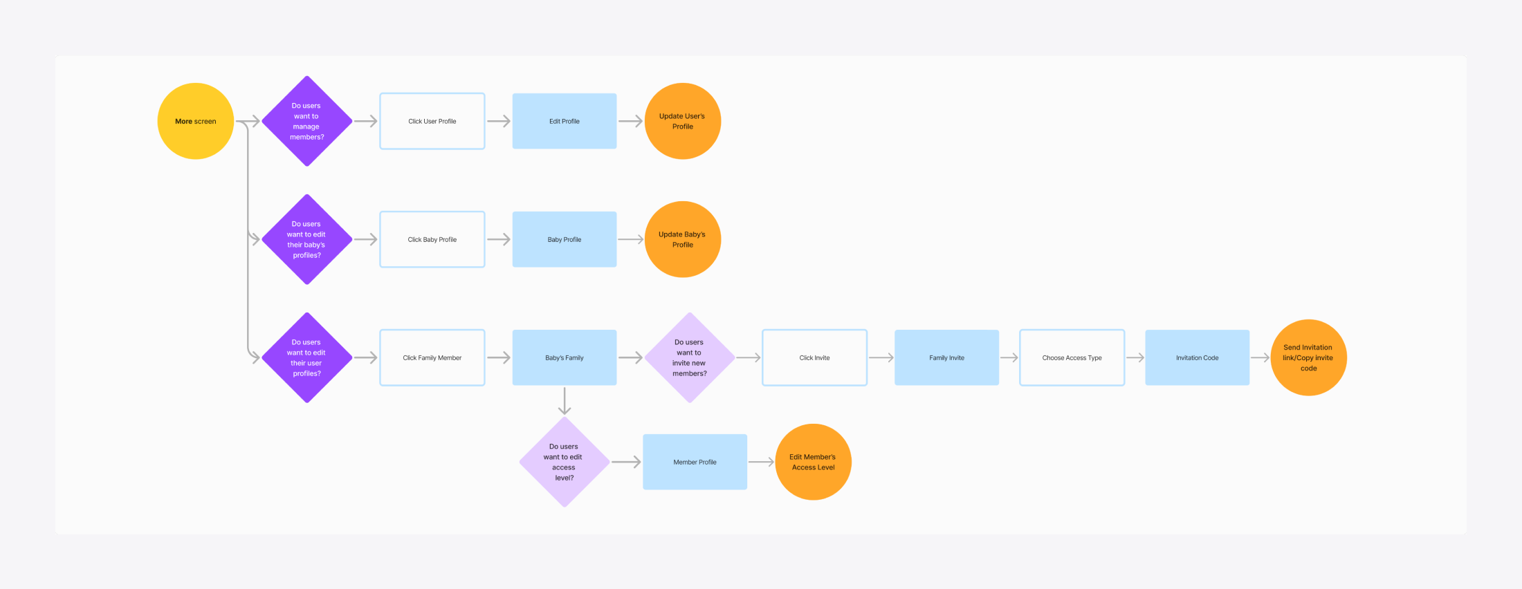
Finding Bottlenecks in Navigation and Access Roles
To uncover challenges in the More tab's key user flows, I analyzed the three main tasks users perform: managing family members, baby profiles and user profiles. An in-depth analysis of user interactions in the original family invitation flow, a primary challenge for this project, revealed critical usability bottlenecks:
Critical Usability Bottlenecks
- The family invitation flow was buried under multiple menus, discouraging users from completing family invitations.
- Redundant steps and unclear decisions created friction, increasing cognitive load and support inquiries.
Key Takeaways
- Simplifying the invitation flow could increase conversions.
- Removing unnecessary steps would reduce cognitive load.
- Clarifying access roles could improve engagement and reduce support burden.
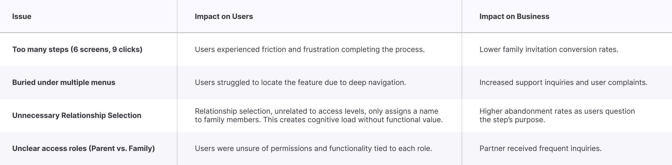
Key Issues and Impacts
Current User Flows
Using Heuristics to Reveal Hidden Friction
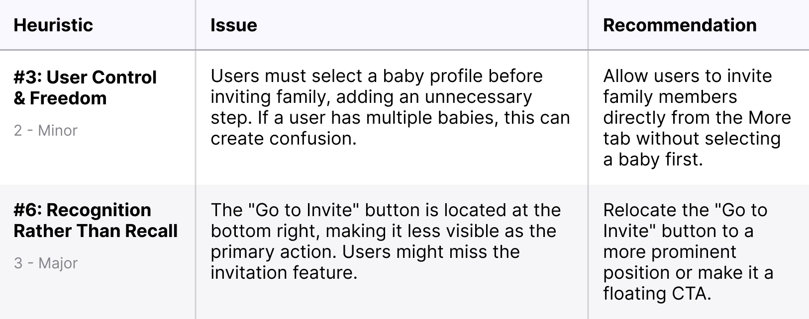
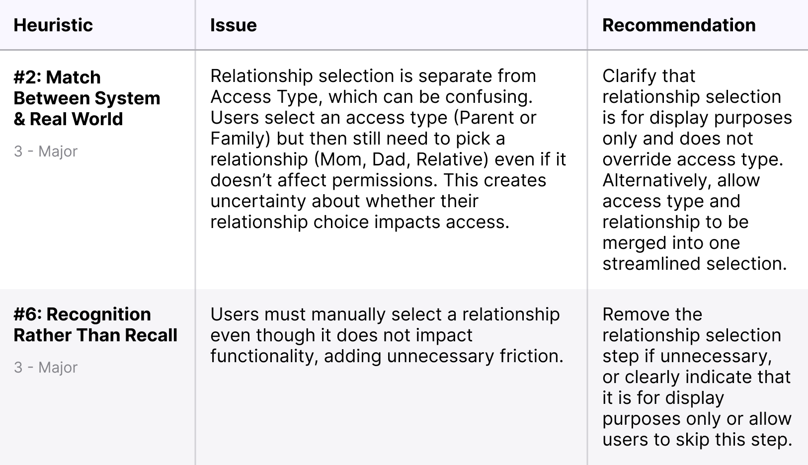
To assess the further usability of the Family Invitation Flow within the More tab, I conducted a heuristic evaluation using Jakob Nielsen’s 10 Usability Heuristics. The goal was to identify friction points, navigation inefficiencies, and areas where users might struggle. Through this evaluation, I was able to identify major friction points in the family invitation flow:
Major Friction Points
- Deep navigation layers made key actions hard to find.
- Inconsistent labels & unclear hierarchy confused users.
- A selection with no functionality led to misunderstanding.
Key Takeaways
- Surface key actions to reduce deep navigation layers.
- Improve labeling & hierarchy to align with mental models.
- Remove unnecessary decisions to streamline the process.
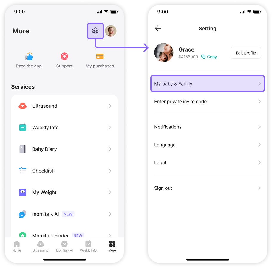
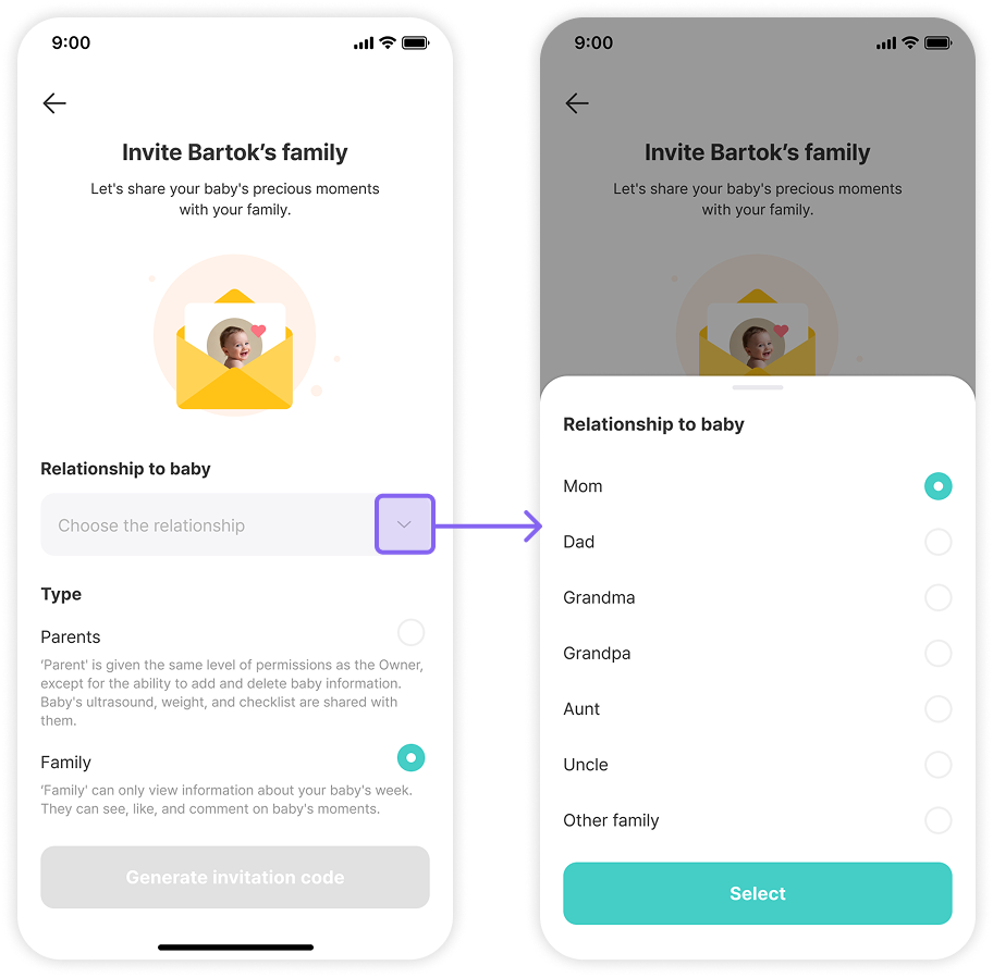
Step #1: Accessing Family Invitation from the More Tab
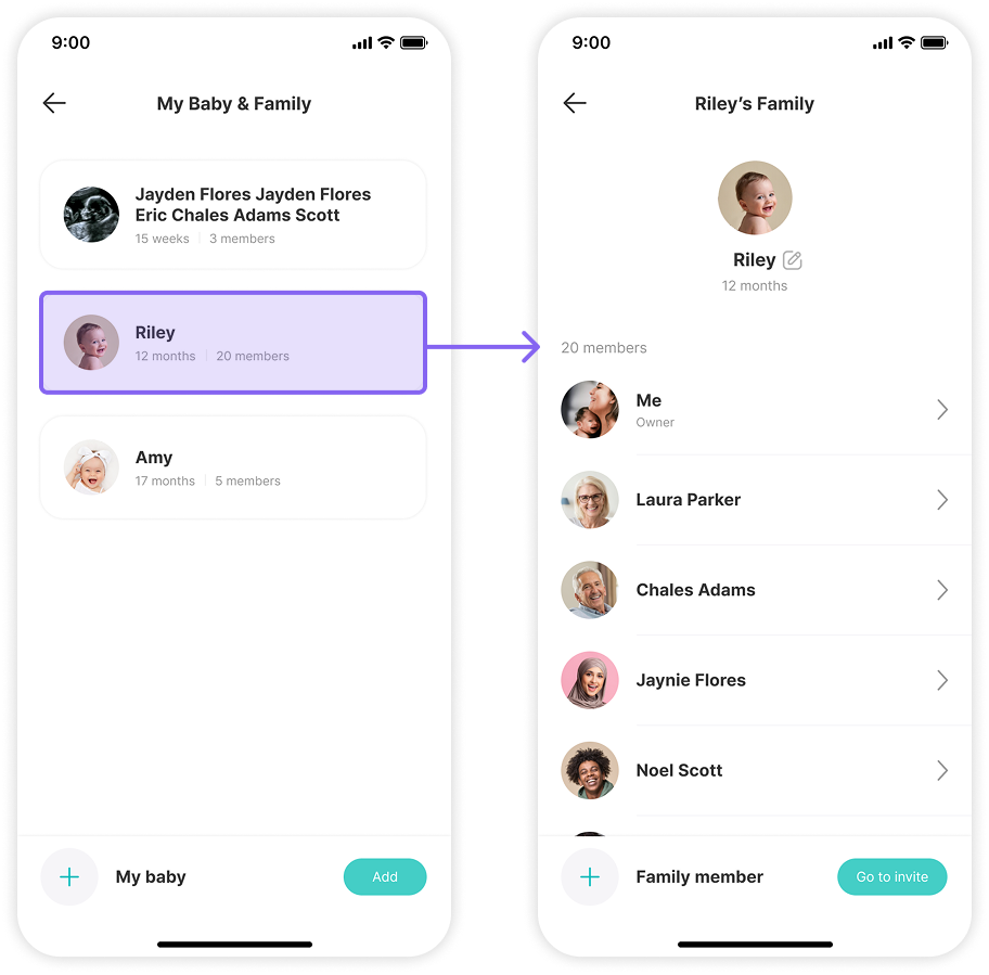
Step #2: Navigating through Baby Profiles to Family Invitation
Step #3: Selecting Relationship and Access Level
Define
Defining Principles for More Intuitive Collaboration
Research revealed that users struggled with the family invitation flow due to deep navigation layers, unnecessary steps, and unclear access roles. These friction points increased frustration and drop-off rates, highlighting the need for a simpler, more intuitive approach. To improve usability and engagement, I established three guiding principles: Simplicity, Discoverability, and Clarity. By applying these principles, I ensured that users could seamlessly invite family members and navigate the "More" tab, leading to an intuitive and frustration-free experience.
Simplicity
To reduce effort and friction during navigation
Discoverability
To make key actions instantly recognizable
Clarity
To ensure role and permission transparency
Ideate
Redefining Access Roles for Clarity and Trust
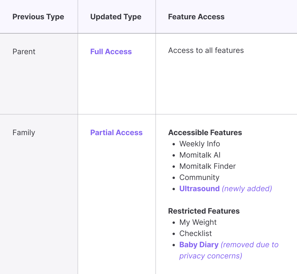
To start the redesign, the product manager and I redefined access levels to eliminate confusion and improve engagement. The original “Parent” and “Family” roles caused frequent misunderstandings. Users were unsure of permissions, especially for features like ultrasound access. To simplify role clarity and improve engagement, we:
- Replaced vague access types with “Full Access” & “Partial Access” to better align with user expectations.
- Removed unnecessary relationship selection, reducing confusion in the invitation process.
- Expanded Partial Access to include ultrasound viewing, making it more valuable for family members.
- Restricted Baby Diary in Partial Access to protect privacy for moms.
These changes eliminated confusion, reduced support inquiries, and made family member access types easier to understand at a glance.
Streamlining the Invitation Flow to Increase Completion
Building on the earlier user flow analysis, I redesigned the More tab’s key interactions to improve usability and efficiency. The original Family Invitation Flow was too complex, requiring multiple screens and redundant decisions before users could invite a family member. To streamline the process and increase invitations, I:
- Reduced steps from 6 to 4, eliminating redundant actions.
- Improved discoverability by positioning a profile management section within the "More" tab.
- Simplified navigation, making invitations faster and more intuitive.
These refinements reduced user frustration, improved completion rates, and increased family engagement.
Refined User Flows
Prototype
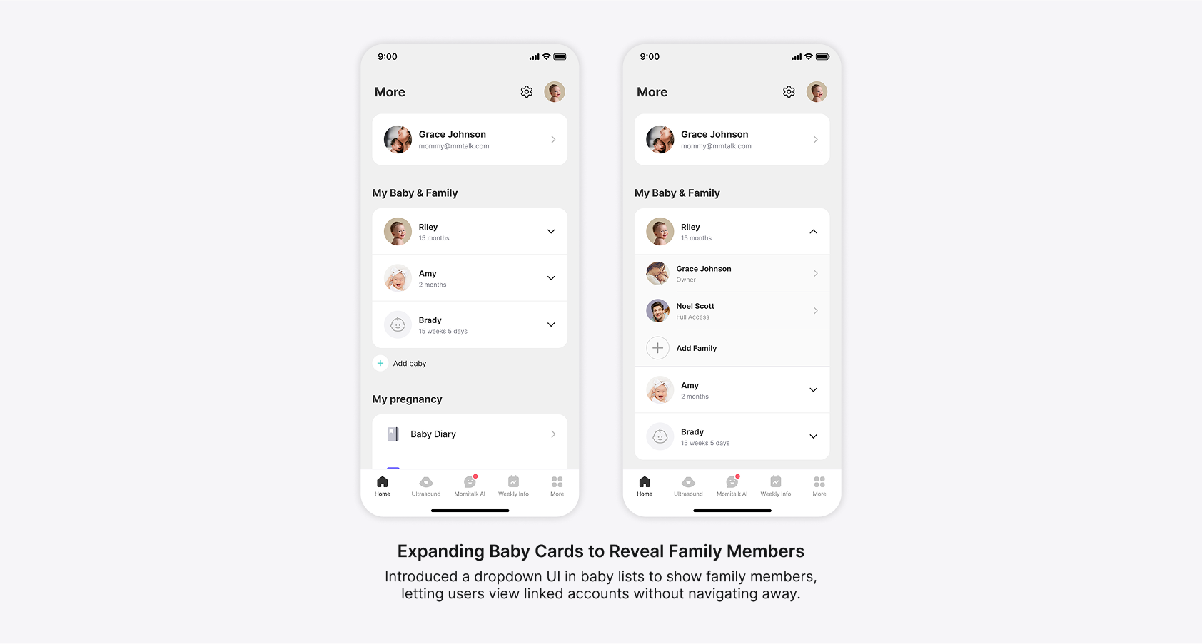
Testing Expandable Cards to Reduce Clutter
To reduce clutter, I tested a progressive disclosure approach, allowing users to expand baby profiles to reveal family members. While this kept the UI clean, it introduced interaction confusion and scalability problems:
Feedback Highlights
- Scalability concerns: If a baby had many family members, the dropdown became overwhelming.
- Unclear touch targets: Users mistakenly tapped profiles, expecting to expand them, but were redirected to a different screen instead.
Design Decisions
- Separated navigation actions: Ensured clear differentiation between profile access and dropdown expansion.
- Explored alternative layouts: Prevented overcrowding while keeping the interface intuitive.
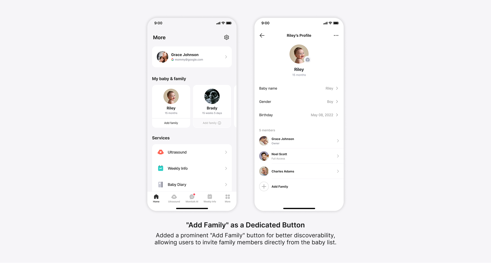
Improving Discoverability with Smarter CTA Placement
To increase visibility, I explored a dedicated “Add Family” button directly within the "More" tab. While it improved discoverability, new challenges emerged.
Feedback Highlights
- Redundant CTA placement: "Add Baby" buttons appeared in multiple locations, causing clutter.
- Inactive state confusion: Partial Access users saw a disabled button, leading to frustration and usability concerns.
- Below-the-fold risk: Expanding baby profiles pushed family members out of immediate view, affecting usability.
Design Decisions
- Refined button placement: Ensured clarity without redundancy.
- Optimized layout: Kept family members visible without excessive scrolling.
- Revised inactive states: Prevented users from encountering empty, unusable spaces.
Deliver
Delivering an Intuitive, Scalable Family Invitation and Management Experience
Building on iterative design explorations, I created a streamlined solution that simplifies navigation, clarifies roles, and scales effortlessly for families with multiple members or children. The final design improves both the structure and functionality of family-related features within the "More" tab, making access easier and engagement more natural. Key improvements include:
- Streamlined family invitation flow that reduces steps and minimizes friction.
- Dedicated profile management that separates user, baby, and family controls for clarity.
- Simplified access levels with renamed roles and restructured permissions.
- Redesigned the “More” screen with improved hierarchy to reduce navigation time.
These updates transform a confusing, fragmented flow into a smooth, accessible experience, empowering families to manage profiles and permissions confidently.
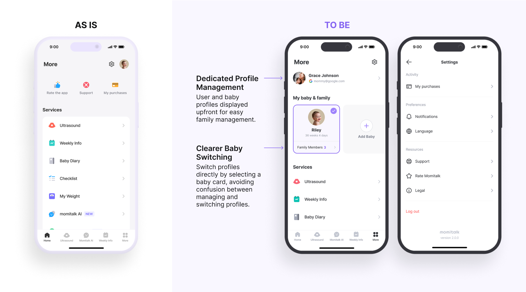
Improving Navigation for Faster Profile Management
To reduce confusion and improve navigation efficiency, I restructured the “More” tab into a clearly segmented profile management area. The updated design distinctly separates user profiles, baby profiles, and family member controls, eliminating the previous ambiguity around profile switching and management. Key improvements include:
- Dedicated profile management section for easy access to user, baby, and family settings.
- Card-based baby profile switching to replace the unclear icon-based method.
- Streamlined settings menu with clearly labeled sections and icons for faster task completion.
This redesign empowers users to manage profiles with clarity and confidence, while laying a stronger foundation for future scalability.
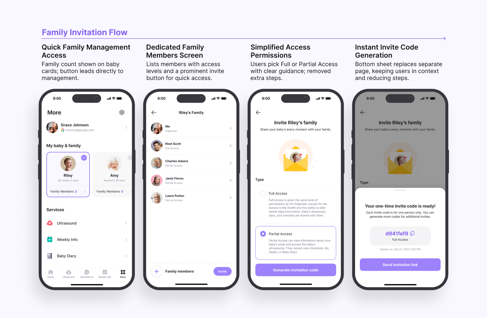
Simplifying Family Invitations with Fewer Steps and Clear Roles
To make the family invitation process more intuitive, I reduced unnecessary steps, improved entry points, and clarified access levels. The redesigned flow removes friction and gives users more control over who can do what while keeping the experience accessible for first-time and returning users. Key improvements include:
- Direct access to family management from the “More” tab to reduce navigation depth.
- Dedicated Family Members screen that clearly displays roles and permissions.
- Refined access levels with simplified labels (Full & Partial Access) for easier decision-making.
These changes make it easier for families to collaborate within the app, improving usability.
Measure
Doubling Adoption While Reducing Support Inquiries
After launching the redesign, accepted invitations increased by over 100% within one month, validating the impact of improved usability and discoverability. Users could now easily invite family members without confusion, resulting in higher engagement and fewer support inquiries. Partner feedback reinforced these results, highlighting smoother workflows and improved patient engagement. The upward trend suggests that the redesign continues to drive long-term adoption of family management within the app.
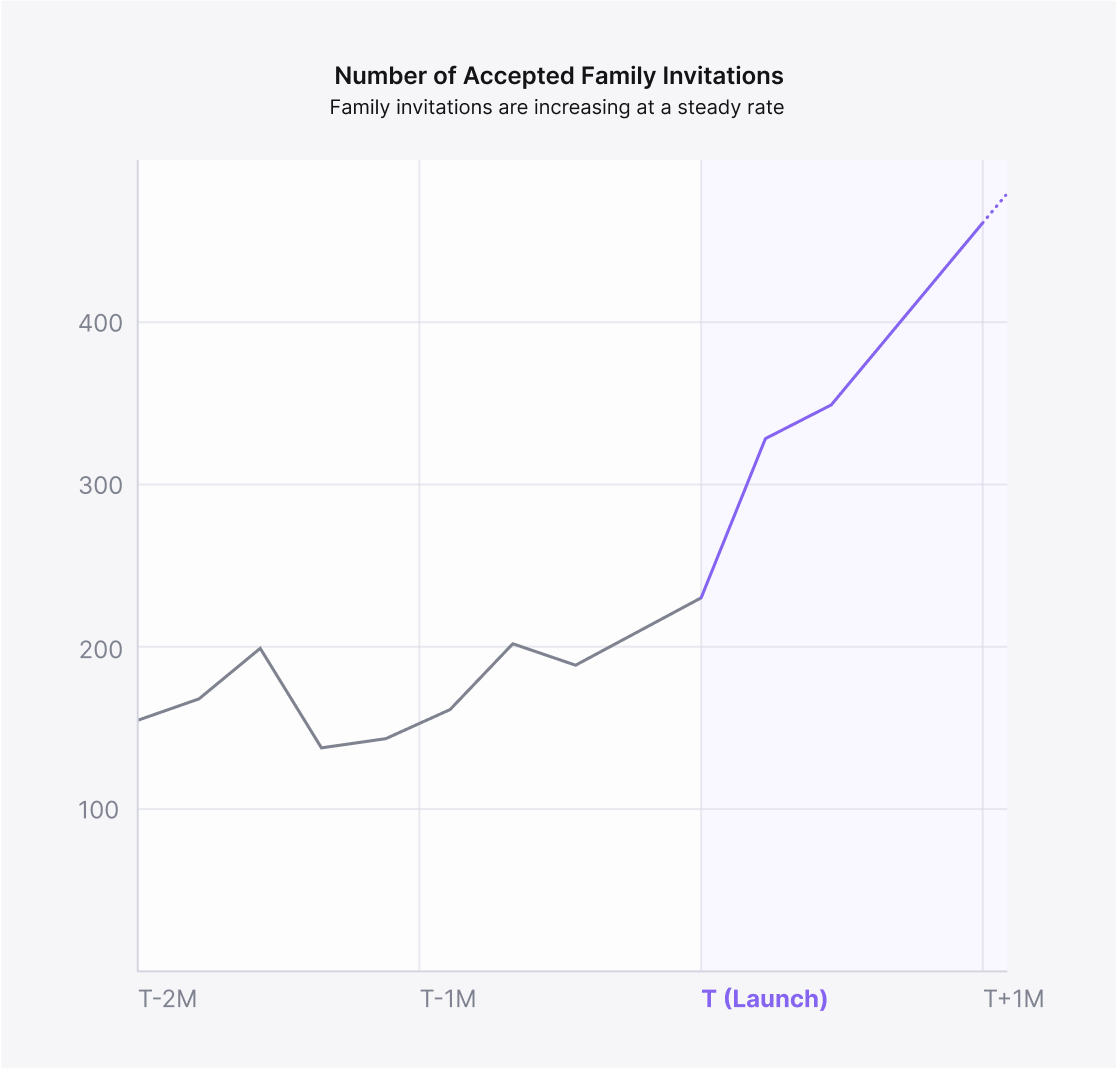
100%+
Growth in linked member acquisition
Partner Feedback

Since the update, we’ve noticed far fewer patient questions about how to invite family members. It allows us to focus more on patient care.
Momitalk Partner Clinic in Indonesia

We've observed a clear drop in support tickets related to family invitations. The redesign has made the process intuitive, significantly reducing confusion.
Humanscape Vietnam Support Team
Reflect
Lessons Learned and Opportunities
The redesigned family invitation flow improved usability, driving a significant increase in accepted invitations while reducing user confusion and support inquiries. However, as the project evolved, scope expansion required careful prioritization and timeline management to stay on track. Moving forward, future scalability must account for multi-baby households, ensuring that access levels remain flexible and adaptable as the user base grows.
What Worked
Simplified Flow Drove 100%+ Growth in Family Invitations
Redesigning the invitation flow led to a 100%+ increase in accepted invitations, improving usability and engagement. Clearer navigation and permissions reduced confusion, while fewer support inquiries eased partner workload.
Areas to Improve
Scope Expansion Highlighted the Need for Agile Prioritization
The project, initially a small update, expanded as new challenges emerged. Prioritization and timeline management were key to keeping the project focused. This reinforced the need for flexibility and collaboration in execution.
Next Opportunity
Ensuring Scalability for Multi-Baby Households as User Base Grows
While most users currently register one baby, future scalability must account for users managing multiple children with different access levels as the user base grows.
Streamlining Family Invitations for Clarity and Connection
ROLE
Product Designer

DURATION
1 Week
TEAM
1 Product Manager
1 Product Designer
2 Engineers
Redesigning invitation and profile flows to help expectant families connect faster through fewer steps, clearer access levels, and easier collaboration
Context
Momitalk is a pregnancy support app that helps expecting parents stay informed and connected. As the platform expanded, supporting shared experiences across family members became critical to increasing user engagement and delivering value beyond the primary user. Family features, including invitations and profile controls, emerged as key touchpoints for emotional support and collaborative care during pregnancy.
Problem
The original family invitation flow was hard to find, overly complex, and unclear about user roles and access levels. This caused confusion among users, limited adoption of collaborative features, and generated high volumes of support tickets, negatively impacting both user satisfaction and clinical partner operations.
Solution
I led the redesign of the family invitation and profile management experience, repositioning it around simplicity, clarity, and discoverability. By restructuring navigation, clarifying access roles, and reducing friction across key flows, the experience became easier for families to understand and use, especially for first-time users.
Impact
The redesign doubled the number of accepted invitations in the first month post-launch and significantly reduced support inquiries. This strengthened family engagement, eased the burden on partner clinics, and laid the groundwork for future scalability in multi-member, multi-child households.
Discover
Uncovering Barriers in the Family Invitation Experience
By analyzing user behavior, feedback, and partner concerns, I uncovered key pain points that hindered usability and engagement. These issues included difficulty navigating the app, disruptions to partner workflows, and low conversion rates, all of which required a streamlined solution. Addressing these pain points presented a clear opportunity to simplify processes, clarify access levels, and improve overall user satisfaction.
User
Pain Point
A buried and complicated invitation flow reduced usability, and restricted roles made key features like ultrasounds inaccessible.
Opportunity
Simplifying the invitation process and clarifying access roles can improve user satisfaction.
Stakeholder
Pain Point
Frequent inquiries from users about adding family members disrupted clinic and hospital workflows, limiting their focus on core services.
Opportunity
Streamlining the family addition process can reduce the administrative burden on partners.
Business
Pain Point
Low family conversion rates and limited engagement impacted retention and app effectiveness.
Opportunity
Improving these flows can boost retention and increase engagement, fostering a seamless experience.
Finding Bottlenecks in Navigation and Access Roles
To uncover challenges in the More tab's key user flows, I analyzed the three main tasks users perform: managing family members, baby profiles and user profiles. An in-depth analysis of user interactions in the original family invitation flow, a primary challenge for this project, revealed critical usability bottlenecks:
Critical Usability Bottlenecks
- The family invitation flow was buried under multiple menus, discouraging users from completing family invitations.
- Redundant steps and unclear decisions created friction, increasing cognitive load and support inquiries.
Key Takeaways
- Simplifying the invitation flow could increase conversions.
- Removing unnecessary steps would reduce cognitive load.
- Clarifying access roles could improve engagement and reduce support burden.
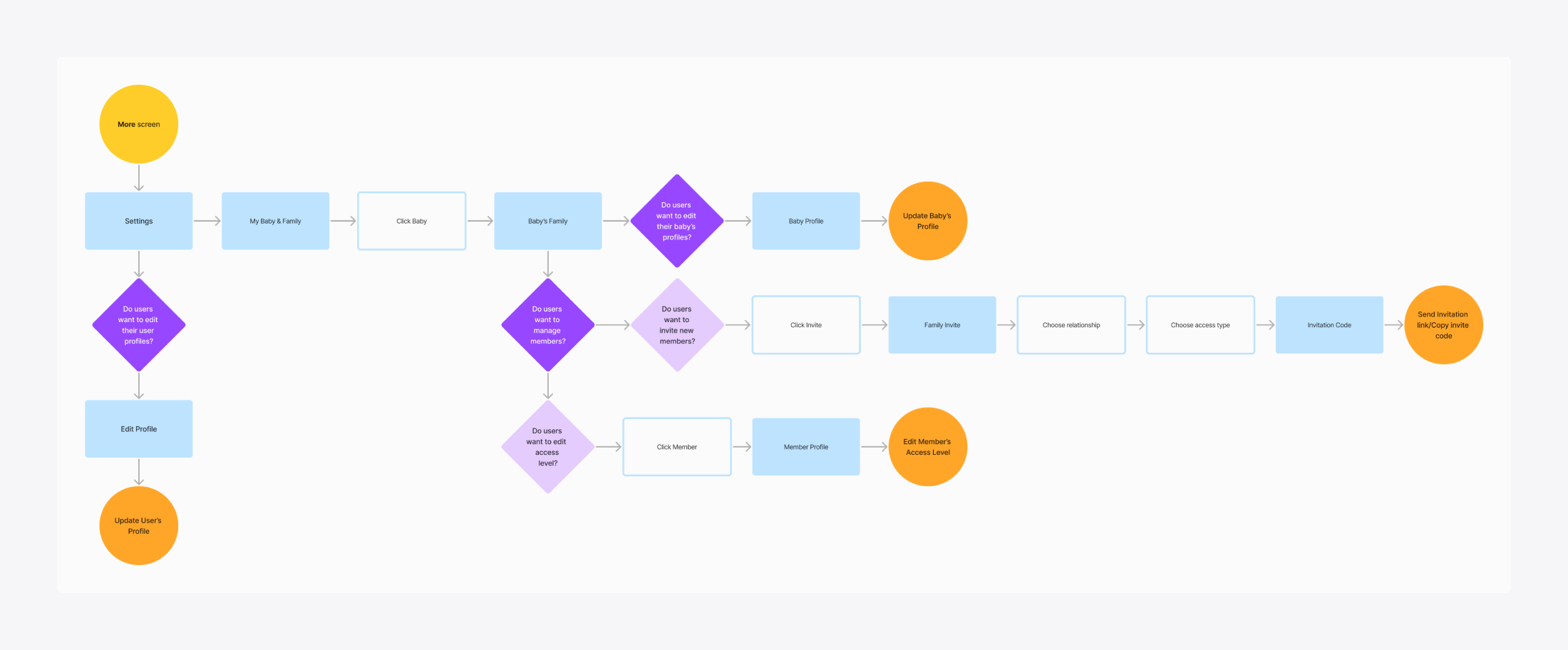
Key Issues and Impacts
Current User Flows
Using Heuristics to Reveal Hidden Friction
To assess the further usability of the Family Invitation Flow within the More tab, I conducted a heuristic evaluation using Jakob Nielsen’s 10 Usability Heuristics. The goal was to identify friction points, navigation inefficiencies, and areas where users might struggle. Through this evaluation, I was able to identify major friction points in the family invitation flow:
Major Friction Points
- Deep navigation layers made key actions hard to find.
- Inconsistent labels & unclear hierarchy confused users.
- A selection with no functionality led to misunderstanding.
Key Takeaways
- Surface key actions to reduce deep navigation layers.
- Improve labeling & hierarchy to align with mental models.
- Remove unnecessary decisions to streamline the process.
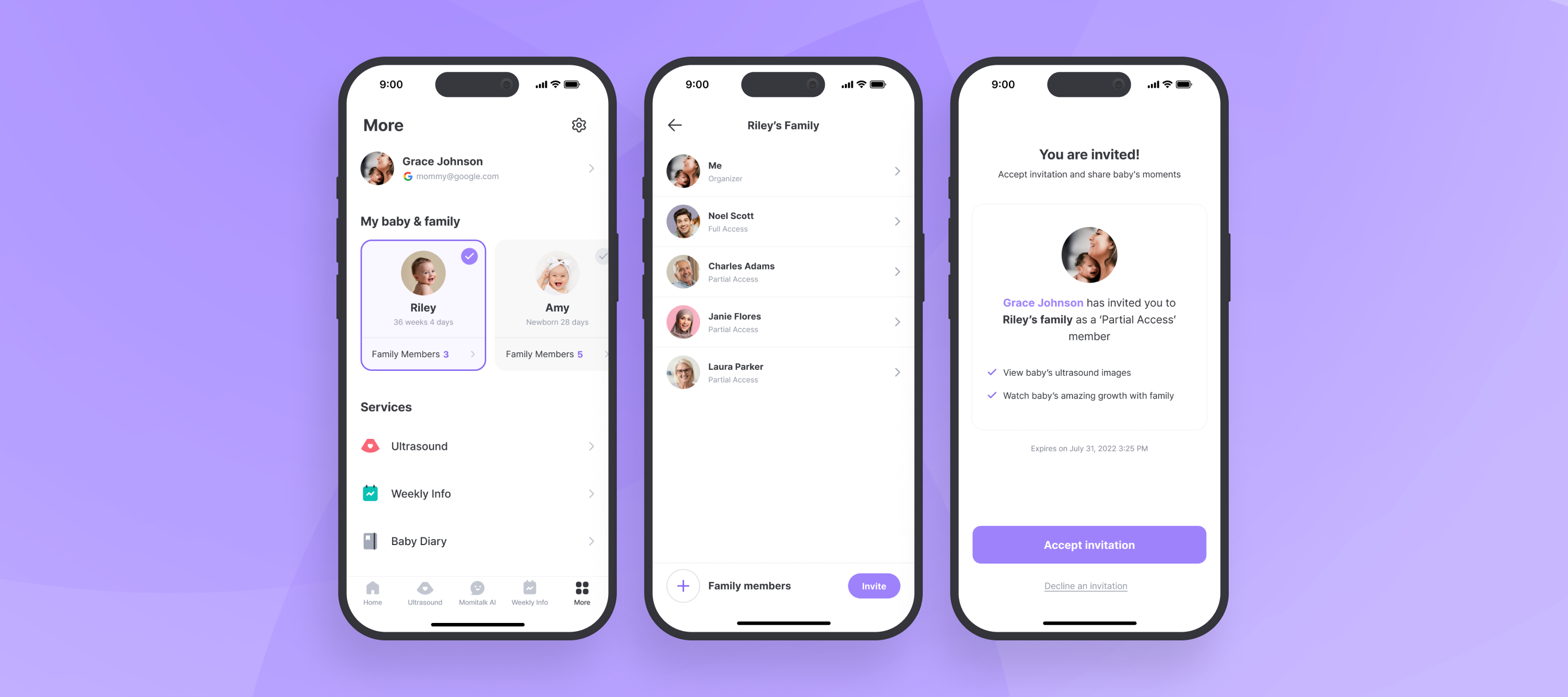
Step #1: Accessing Family Invitation from the More Tab
Step #2: Navigating through Baby Profiles to Family Invitation
Step #3: Selecting Relationship and Access Level
Define
Defining Principles for More Intuitive Collaboration
Research revealed that users struggled with the family invitation flow due to deep navigation layers, unnecessary steps, and unclear access roles. These friction points increased frustration and drop-off rates, highlighting the need for a simpler, more intuitive approach. To improve usability and engagement, I established three guiding principles: Simplicity, Discoverability, and Clarity. By applying these principles, I ensured that users could seamlessly invite family members and navigate the "More" tab, leading to an intuitive and frustration-free experience.
Simplicity
To reduce effort and friction during navigation
Discoverability
To make key actions instantly recognizable
Clarity
To ensure role and permission transparency
Ideate
Redefining Access Roles for Clarity and Trust
To start the redesign, the product manager and I redefined access levels to eliminate confusion and improve engagement. The original “Parent” and “Family” roles caused frequent misunderstandings. Users were unsure of permissions, especially for features like ultrasound access. To simplify role clarity and improve engagement, we:
- Replaced vague access types with “Full Access” & “Partial Access” to better align with user expectations.
- Removed unnecessary relationship selection, reducing confusion in the invitation process.
- Expanded Partial Access to include ultrasound viewing, making it more valuable for family members.
- Restricted Baby Diary in Partial Access to protect privacy for moms.
These changes eliminated confusion, reduced support inquiries, and made family member access types easier to understand at a glance.
Streamlining the Invitation Flow to Increase Completion
Building on the earlier user flow analysis, I redesigned the More tab’s key interactions to improve usability and efficiency. The original Family Invitation Flow was too complex, requiring multiple screens and redundant decisions before users could invite a family member. To streamline the process and increase invitations, I:
- Reduced steps from 6 to 4, eliminating redundant actions.
- Improved discoverability by positioning a profile management section within the "More" tab.
- Simplified navigation, making invitations faster and more intuitive.
These refinements reduced user frustration, improved completion rates, and increased family engagement.
Refined User Flows
Prototype
Testing Expandable Cards to Reduce Clutter
To reduce clutter, I tested a progressive disclosure approach, allowing users to expand baby profiles to reveal family members. While this kept the UI clean, it introduced interaction confusion and scalability problems:
Feedback Highlights
- Scalability concerns: If a baby had many family members, the dropdown became overwhelming.
- Unclear touch targets: Users mistakenly tapped profiles, expecting to expand them, but were redirected to a different screen instead.
Design Decisions
- Separated navigation actions: Ensured clear differentiation between profile access and dropdown expansion.
- Explored alternative layouts: Prevented overcrowding while keeping the interface intuitive.
Improving Discoverability with Smarter CTA Placement
To increase visibility, I explored a dedicated “Add Family” button directly within the "More" tab. While it improved discoverability, new challenges emerged.
Feedback Highlights
- Redundant CTA placement: "Add Baby" buttons appeared in multiple locations, causing clutter.
- Inactive state confusion: Partial Access users saw a disabled button, leading to frustration and usability concerns.
- Below-the-fold risk: Expanding baby profiles pushed family members out of immediate view, affecting usability.
Design Decisions
- Refined button placement: Ensured clarity without redundancy.
- Optimized layout: Kept family members visible without excessive scrolling.
- Revised inactive states: Prevented users from encountering empty, unusable spaces.
Deliver
Delivering an Intuitive, Scalable Family Invitation and Management Experience
Building on iterative design explorations, I created a streamlined solution that simplifies navigation, clarifies roles, and scales effortlessly for families with multiple members or children. The final design improves both the structure and functionality of family-related features within the "More" tab, making access easier and engagement more natural. Key improvements include:
- Streamlined family invitation flow that reduces steps and minimizes friction.
- Dedicated profile management that separates user, baby, and family controls for clarity.
- Simplified access levels with renamed roles and restructured permissions.
- Redesigned the “More” screen with improved hierarchy to reduce navigation time.
These updates transform a confusing, fragmented flow into a smooth, accessible experience, empowering families to manage profiles and permissions confidently.
Improving Navigation for Faster Profile Management
To reduce confusion and improve navigation efficiency, I restructured the “More” tab into a clearly segmented profile management area. The updated design distinctly separates user profiles, baby profiles, and family member controls, eliminating the previous ambiguity around profile switching and management. Key improvements include:
- Dedicated profile management section for easy access to user, baby, and family settings.
- Card-based baby profile switching to replace the unclear icon-based method.
- Streamlined settings menu with clearly labeled sections and icons for faster task completion.
This redesign empowers users to manage profiles with clarity and confidence, while laying a stronger foundation for future scalability.
Simplifying Family Invitations with Fewer Steps and Clear Roles
To make the family invitation process more intuitive, I reduced unnecessary steps, improved entry points, and clarified access levels. The redesigned flow removes friction and gives users more control over who can do what while keeping the experience accessible for first-time and returning users. Key improvements include:
- Direct access to family management from the “More” tab to reduce navigation depth.
- Dedicated Family Members screen that clearly displays roles and permissions.
- Refined access levels with simplified labels (Full & Partial Access) for easier decision-making.
These changes make it easier for families to collaborate within the app, improving usability.
Measure
Doubling Adoption While Reducing Support Inquiries
After launching the redesign, accepted invitations increased by over 100% within one month, validating the impact of improved usability and discoverability. Users could now easily invite family members without confusion, resulting in higher engagement and fewer support inquiries. Partner feedback reinforced these results, highlighting smoother workflows and improved patient engagement. The upward trend suggests that the redesign continues to drive long-term adoption of family management within the app.
100%+
Growth in linked member acquisition
Partner Feedback
Since the update, we’ve noticed far fewer patient questions about how to invite family members. It allows us to focus more on patient care.
Momitalk Partner Clinic in Indonesia
We've observed a clear drop in support tickets related to family invitations. The redesign has made the process intuitive, significantly reducing confusion.
Humanscape Vietnam Support Team
Reflect
Lessons Learned and Opportunities
The redesigned family invitation flow improved usability, driving a significant increase in accepted invitations while reducing user confusion and support inquiries. However, as the project evolved, scope expansion required careful prioritization and timeline management to stay on track. Moving forward, future scalability must account for multi-baby households, ensuring that access levels remain flexible and adaptable as the user base grows.
What Worked
Simplified Flow Drove 100%+ Growth in Family Invitations
Redesigning the invitation flow led to a 100%+ increase in accepted invitations, improving usability and engagement. Clearer navigation and permissions reduced confusion, while fewer support inquiries eased partner workload.
Areas to Improve
Scope Expansion Highlighted the Need for Agile Prioritization
The project, initially a small update, expanded as new challenges emerged. Prioritization and timeline management were key to keeping the project focused. This reinforced the need for flexibility and collaboration in execution.
Next Opportunity
Ensuring Scalability for Multi-Baby Households as User Base Grows
While most users currently register one baby, future scalability must account for users managing multiple children with different access levels as the user base grows.
Streamlining Family Invitations for Clarity and Connection
ROLE
Product Designer

DURATION
1 Week
TEAM
1 Product Manager
1 Product Designer
2 Engineers
Redesigning invitation and profile flows to help expectant families connect faster through fewer steps, clearer access levels, and easier collaboration
Context
Momitalk is a pregnancy support app that helps expecting parents stay informed and connected. As the platform expanded, supporting shared experiences across family members became critical to increasing user engagement and delivering value beyond the primary user. Family features, including invitations and profile controls, emerged as key touchpoints for emotional support and collaborative care during pregnancy.
Problem
The original family invitation flow was hard to find, overly complex, and unclear about user roles and access levels. This caused confusion among users, limited adoption of collaborative features, and generated high volumes of support tickets, negatively impacting both user satisfaction and clinical partner operations.
Solution
I led the redesign of the family invitation and profile management experience, repositioning it around simplicity, clarity, and discoverability. By restructuring navigation, clarifying access roles, and reducing friction across key flows, the experience became easier for families to understand and use, especially for first-time users.
Impact
The redesign doubled the number of accepted invitations in the first month post-launch and significantly reduced support inquiries. This strengthened family engagement, eased the burden on partner clinics, and laid the groundwork for future scalability in multi-member, multi-child households.
Discover
Uncovering Barriers in the Family Invitation Experience
By analyzing user behavior, feedback, and partner concerns, I uncovered key pain points that hindered usability and engagement. These issues included difficulty navigating the app, disruptions to partner workflows, and low conversion rates, all of which required a streamlined solution. Addressing these pain points presented a clear opportunity to simplify processes, clarify access levels, and improve overall user satisfaction.
User
Pain Point
A buried and complicated invitation flow reduced usability, and restricted roles made key features like ultrasounds inaccessible.
Opportunity
Simplifying the invitation process and clarifying access roles can improve user satisfaction.
Stakeholder
Pain Point
Frequent inquiries from users about adding family members disrupted clinic and hospital workflows, limiting their focus on core services.
Opportunity
Streamlining the family addition process can reduce the administrative burden on partners.
Business
Pain Point
Low family conversion rates and limited engagement impacted retention and app effectiveness.
Opportunity
Improving these flows can boost retention and increase engagement, fostering a seamless experience.
Finding Bottlenecks in Navigation and Access Roles
To uncover challenges in the More tab's key user flows, I analyzed the three main tasks users perform: managing family members, baby profiles and user profiles. An in-depth analysis of user interactions in the original family invitation flow, a primary challenge for this project, revealed critical usability bottlenecks:
Critical Usability Bottlenecks
- The family invitation flow was buried under multiple menus, discouraging users from completing family invitations.
- Redundant steps and unclear decisions created friction, increasing cognitive load and support inquiries.
Key Takeaways
- Simplifying the invitation flow could increase conversions.
- Removing unnecessary steps would reduce cognitive load.
- Clarifying access roles could improve engagement and reduce support burden.
Key Issues and Impacts
Current User Flows
Using Heuristics to Reveal Hidden Friction
To assess the further usability of the Family Invitation Flow within the More tab, I conducted a heuristic evaluation using Jakob Nielsen’s 10 Usability Heuristics. The goal was to identify friction points, navigation inefficiencies, and areas where users might struggle. Through this evaluation, I was able to identify major friction points in the family invitation flow:
Major Friction Points
- Deep navigation layers made key actions hard to find.
- Inconsistent labels & unclear hierarchy confused users.
- A selection with no functionality led to misunderstanding.
Key Takeaways
- Surface key actions to reduce deep navigation layers.
- Improve labeling & hierarchy to align with mental models.
- Remove unnecessary decisions to streamline the process.
Step #1: Accessing Family Invitation from the More Tab
Step #2: Navigating through Baby Profiles to Family Invitation
Step #3: Selecting Relationship and Access Level
Define
Defining Principles for More Intuitive Collaboration
Research revealed that users struggled with the family invitation flow due to deep navigation layers, unnecessary steps, and unclear access roles. These friction points increased frustration and drop-off rates, highlighting the need for a simpler, more intuitive approach. To improve usability and engagement, I established three guiding principles: Simplicity, Discoverability, and Clarity. By applying these principles, I ensured that users could seamlessly invite family members and navigate the "More" tab, leading to an intuitive and frustration-free experience.
Simplicity
To reduce effort and friction during navigation
Discoverability
To make key actions
instantly recognizable
Clarity
To ensure role and permission transparency
Ideate
Redefining Access Roles for Clarity and Trust
To start the redesign, the product manager and I redefined access levels to eliminate confusion and improve engagement. The original “Parent” and “Family” roles caused frequent misunderstandings. Users were unsure of permissions, especially for features like ultrasound access. To simplify role clarity and improve engagement, we:
- Replaced vague access types with “Full Access” & “Partial Access” to better align with user expectations.
- Removed unnecessary relationship selection, reducing confusion in the invitation process.
- Expanded Partial Access to include ultrasound viewing, making it more valuable for family members.
- Restricted Baby Diary in Partial Access to protect privacy for moms.
These changes eliminated confusion, reduced support inquiries, and made family member access types easier to understand at a glance.
Streamlining the Invitation Flow to Increase Completion
Building on the earlier user flow analysis, I redesigned the More tab’s key interactions to improve usability and efficiency. The original Family Invitation Flow was too complex, requiring multiple screens and redundant decisions before users could invite a family member. To streamline the process and increase invitations, I:
- Reduced steps from 6 to 4, eliminating redundant actions.
- Improved discoverability by positioning a profile management section within the "More" tab.
- Simplified navigation, making invitations faster and more intuitive.
These refinements reduced user frustration, improved completion rates, and increased family engagement.
Refined User Flows
Prototype
Testing Expandable Cards to Reduce Clutter
To reduce clutter, I tested a progressive disclosure approach, allowing users to expand baby profiles to reveal family members. While this kept the UI clean, it introduced interaction confusion and scalability problems:
Feedback Highlights
- Scalability concerns: If a baby had many family members, the dropdown became overwhelming.
- Unclear touch targets: Users mistakenly tapped profiles, expecting to expand them, but were redirected to a different screen instead.
Design Decisions
- Separated navigation actions: Ensured clear differentiation between profile access and dropdown expansion.
- Explored alternative layouts: Prevented overcrowding while keeping the interface intuitive.
Improving Discoverability with Smarter CTA Placement
To increase visibility, I explored a dedicated “Add Family” button directly within the "More" tab. While it improved discoverability, new challenges emerged.
Feedback Highlights
- Redundant CTA placement: "Add Baby" buttons appeared in multiple locations, causing clutter.
- Inactive state confusion: Partial Access users saw a disabled button, leading to frustration and usability concerns.
- Below-the-fold risk: Expanding baby profiles pushed family members out of immediate view, affecting usability.
Design Decisions
- Refined button placement: Ensured clarity without redundancy.
- Optimized layout: Kept family members visible without excessive scrolling.
- Revised inactive states: Prevented users from encountering empty, unusable spaces.
Deliver
Delivering an Intuitive, Scalable Family Invitation and Management Experience
Building on iterative design explorations, I created a streamlined solution that simplifies navigation, clarifies roles, and scales effortlessly for families with multiple members or children. The final design improves both the structure and functionality of family-related features within the "More" tab, making access easier and engagement more natural. Key improvements include:
- Streamlined family invitation flow that reduces steps and minimizes friction.
- Dedicated profile management that separates user, baby, and family controls for clarity.
- Simplified access levels with renamed roles and restructured permissions.
- Redesigned the “More” screen with improved hierarchy to reduce navigation time.
These updates transform a confusing, fragmented flow into a smooth, accessible experience, empowering families to manage profiles and permissions confidently.
Improving Navigation for Faster Profile Management
To reduce confusion and improve navigation efficiency, I restructured the “More” tab into a clearly segmented profile management area. The updated design distinctly separates user profiles, baby profiles, and family member controls, eliminating the previous ambiguity around profile switching and management. Key improvements include:
- Dedicated profile management section for easy access to user, baby, and family settings.
- Card-based baby profile switching to replace the unclear icon-based method.
- Streamlined settings menu with clearly labeled sections and icons for faster task completion.
This redesign empowers users to manage profiles with clarity and confidence, while laying a stronger foundation for future scalability.
Simplifying Family Invitations with Fewer Steps and Clear Roles
To make the family invitation process more intuitive, I reduced unnecessary steps, improved entry points, and clarified access levels. The redesigned flow removes friction and gives users more control over who can do what while keeping the experience accessible for first-time and returning users. Key improvements include:
- Direct access to family management from the “More” tab to reduce navigation depth.
- Dedicated Family Members screen that clearly displays roles and permissions.
- Refined access levels with simplified labels (Full & Partial Access) for easier decision-making.
These changes make it easier for families to collaborate within the app, improving usability.
Measure
Doubling Adoption While Reducing Support Inquiries
After launching the redesign, accepted invitations increased by over 100% within one month, validating the impact of improved usability and discoverability. Users could now easily invite family members without confusion, resulting in higher engagement and fewer support inquiries. Partner feedback reinforced these results, highlighting smoother workflows and improved patient engagement. The upward trend suggests that the redesign continues to drive long-term adoption of family management within the app.
100%+
Growth in linked member acquisition
Partner Feedback
Since the update, we’ve noticed far fewer patient questions about how to invite family members. It allows us to focus more on patient care.
Momitalk Partner Clinic in Indonesia
We've observed a clear drop in support tickets related to family invitations. The redesign has made the process intuitive, significantly reducing confusion.
Humanscape Vietnam Support Team
Reflect
Lessons Learned and Opportunities
The redesigned family invitation flow improved usability, driving a significant increase in accepted invitations while reducing user confusion and support inquiries. However, as the project evolved, scope expansion required careful prioritization and timeline management to stay on track. Moving forward, future scalability must account for multi-baby households, ensuring that access levels remain flexible and adaptable as the user base grows.
What Worked
Simplified Flow Drove 100%+ Growth in Family Invitations
Redesigning the invitation flow led to a 100%+ increase in accepted invitations, improving usability and engagement. Clearer navigation and permissions reduced confusion, while fewer support inquiries eased partner workload.
Areas to Improve
Scope Expansion Highlighted the Need for Agile Prioritization
The project, initially a small update, expanded as new challenges emerged. Prioritization and timeline management were key to keeping the project focused. This reinforced the need for flexibility and collaboration in execution.
Next Opportunity
Ensuring Scalability for Multi-Baby Households as User Base Grows
While most users currently register one baby, future scalability must account for users managing multiple children with different access levels as the user base grows.