
Turning an open-ended chatbot into a guided pregnancy companion
Role
Product Designer
Duration
2 Weeks
Team
1 Product Manager 1 Product Designer 2 Engineers

Helping expectant mothers discover meaningful ways to engage with AI through clearer purpose, structured topics, and pregnancy-stage relevance.
Problem & Context
Why curiosity didn’t turn into conversations
Despite high traffic to the AI feature, most users dropped off without meaningful interaction. The funnel analysis revealed a significant engagement gap: users were curious enough to enter the AI tab, but something stopped them from continuing. The Initial problems we framed were:
Unclear purpose: Users were unsure why to engage or what topics they could explore.
Repetitive responses: Conversations felt generic and robotic.
Limited functionality: No compelling reason to return.
Lack of integration: The AI was isolated from other app features.
To design an AI experience that truly supports pregnant users, I needed to understand their emotional and practical needs at different stages of pregnancy.

Mapping user needs by pregnancy stage
To better understand the needs of pregnant moms, I reviewed over 100 user posts in the pregnancy community, conducted 5 user interviews at different stages, and mapped emotional journey patterns across each stage of pregnancy. This revealed a wide range of practical, emotional, and social needs that varied by trimester:
First Trimester: High anxiety and intense information-seeking. Users frequently asked about diet, safe exercises, and early symptoms.
Second Trimester: Emotional bonding and planning took center stage. Users showed curiosity about baby development, gender reveals, and baby shower ideas.
Third Trimester: Reassurance and empathy became critical. Users expressed heightened emotional sensitivity, sleep issues, and fear around labor.

Topic Strategy
Reframing AI as a stage-aware companion
I identified three expansion opportunities based on the key user needs. This shift frames AI as more than a chatbot, emphasizing its role as a considerate daily companion.
Timely
Deliver pregnancy-stage-specific prompts and support
Supportive
Provide empathetic responses to reassure and comfort
Engaging
Introduce fun & practical content balancing seriousness & joy
Designing topics that balance support and delight
To create an AI experience that balances practicality and enjoyment, my team and I held a brainstorming session to explore new conversation topics. We used affinity mapping to categorize our ideas into two main themes: Fun & Entertainment and Health & Pregnancy Management. To ensure our approach is scalable and adaptable, we prioritized ideas that balanced user impact with technical feasibility.
Fun & Entertainment: Engaging conversations that make the pregnancy journey enjoyable.
Health & Pregnancy Management: Topics that provide timely, relevant support.

Testing topics for value, tone, and relevance
To consolidate our ideas, my team and I conducted prompt testing with ChatGPT, evaluating the quality of responses, cultural fit, and relevance. We identified six high-value topics that delivered meaningful interactions with consistent, quality responses.
Evaluation Criteria
Answer Quality: Consistent, accurate, engaging.
Localization: Culturally appropriate for all regions.
User Value: Relevant to pregnant moms.
Top Prioritized Topics
Pregnancy Assistant: Answers pregnancy questions.
Pregnancy Therapist: Supports emotional and mental well-being.
Baby Names: Suggests meaningful names.
Daily Horoscope: Astrology insights for moms and babies.
Story Time: Engaging stories for the baby.
Party Planner: Plans baby showers and gender reveals.

Design Iterations
Making topics easier to find and conversations easier to continue
With the topics selected, I explored how users could find them easily and keep a conversation going, while leaving room for future topic expansion.
The first exploration focused on making AI topics accessible from the home screen and reducing the effort of entering and continuing a conversation. I explored removing onboarding and offering automatically generated quick replies based on the ongoing conversation, while considering how the interface could accommodate more topics over time. Team review highlighted three areas to refine before the next iteration.
Team feedback highlights
Topic visibility and growth: Topics needed to be easy to discover from the home screen, with room for future additions.
Space after onboarding: Removing the onboarding flow left unused space in the layout.
Quick reply quality and relevance: We were not confident that automatically generated quick replies would consistently meet our expectations for content quality and pregnancy relevance in a healthcare context.
Design decisions made in response
Introduce a topic carousel: Surface available topics in a browsable format that could accommodate an expanding topic set.
Prioritize topic discovery: Reallocate the available space to help users explore topics and understand their options.
Move to curated keywords: Replace automatic quick reply generation with keywords manually prepared for pregnancy weeks, allowing the team to review and select the suggestions in advance.

Clarifying topic choices and navigation into chat
Building on the first review, the second exploration focused on how users understood the available topics and moved between browsing and chatting. It incorporated the shift to manually curated pregnancy-week keywords, alongside refinements to topic presentation and navigation. The next review examined whether users could see the range of topics, understand each topic’s purpose, and distinguish exploration from conversation.
Team feedback highlights
Topic overview: The range of available topics needed to be easier to scan before choosing a conversation.
Individualized Topics: Topic purpose: Each topic needed a distinct identity that made its intended role clear.
Navigation clarity: Moving between topic selection and chat was confusing, with insufficient distinction between the two activities.
Design decisions made in response
Add a scrollable topic preview: Let users browse the available topics from the home screen before entering a chat.
Give topics recognizable identities: Use clear names and roles, such as Pregnancy Assistant and Pregnancy Therapist, to set expectations for each conversation.
Separate exploration from conversation: Give topic browsing and chat distinct spaces, with clear navigation between them.

Final Experience
Connecting topic discovery with conversation
After testing multiple design directions, I combined the most impactful ideas into a unified solution that enhances both usability and long-term engagement. The final design makes AI Talk more approachable, meaningful, and integrated across the app experience. Key improvements include:
Accessible entry points through a dynamic carousel and keyword previews.
Clearer purpose and structure with distinct topic personas and simplified navigation.
Personalized content tailored to each pregnancy stage.
Seamless integration with Weekly Info to surface relevant AI topics naturally.
Together, these updates position AI Talk as a trusted companion that is easy to access, relevant at every stage, and built to grow alongside users’ needs.
Exploring topics from the home screen
To increase visibility and reduce entry friction, I replaced the static banner with a dynamic carousel that showcases key topics upfront. This improvement enhances discoverability by:
Enabling instant, one-tap access to conversations.
Encouraging exploration without deep navigation.
Supporting future topic expansion without clutter.
By foregrounding relevant content, this update transformed AI Talk into a feature that users notice and use more often.

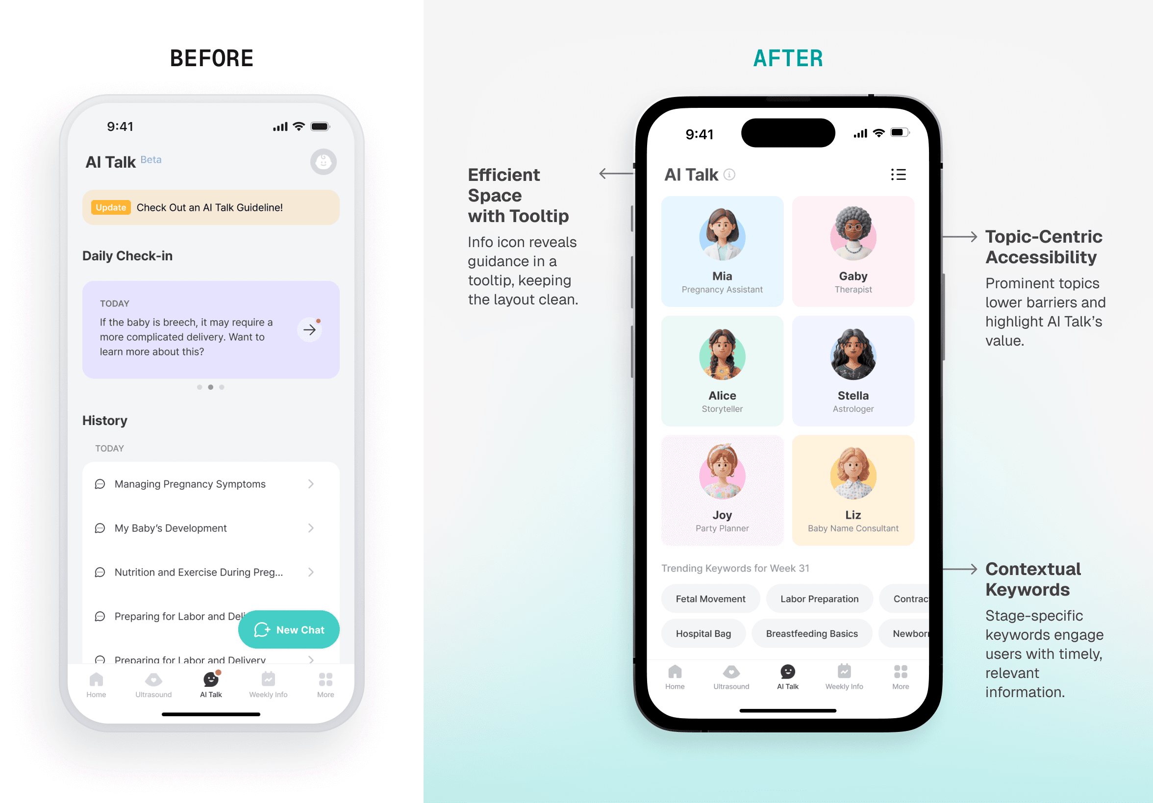
Clarifying conversations with topic personas and stage-specific keywords
To address confusion and cognitive overload, I restructured the AI interface around clear, goal-oriented topic personas (e.g., “Pregnancy Assistant,” “Pregnancy Therapist”). Combined with gestational-age-specific keywords, this approach improves clarity and interaction by:
Helping users understand the role of each topic at a glance.
Sparking curiosity through timely, relevant suggestions.
Replacing lengthy onboarding with lightweight, intuitive cues.
This redesign not only improved usability but also strengthened users' emotional connection.
Keeping topic identities recognizable across the app
To reinforce brand presence and create a cohesive experience, I introduced visual cues that reflect the AI's identity across touchpoints. Enhancements included:
Incorporating recognizable topic icons into Daily Check-In popovers.
Displaying chat topic identities to ground users in context when interacting.
These updates positioned AI Talk as a consistent, recognizable companion with clarity while maintaining flexibility for future topic persona expansions.

Starting relevant conversations from Weekly Info
To increase engagement and reduce feature isolation, I integrated trending keywords into the Weekly Info tab. This cross-functional solution boosts discoverability and retention by:
Surfacing relevant AI topics in sync with the user's pregnancy stage.
Encouraging exploration without requiring manual search.
Creating a seamless flow between educational content and conversation.
By embedding AI within the broader content ecosystem, this update positioned Momitalk AI as a natural, continuous part of the user journey.

Impact
More people started and continued conversations
Following the redesign, a larger share of active users reached the chat, and chat visitors were more likely to send a message and continue the conversation.
45% higher chat reach: In a post-launch follow-up, the share of weekly active users entering a chat was 45% higher than the pre-launch baseline.
43% higher first-message conversion: Conversion increased from approximately 25% to 36% of chat visitors.
72% higher two-message conversion: Conversion to sending at least two messages increased from approximately 17% to 29% of chat visitors.
Repeat use showed a more mixed picture. Next-week message retention rose modestly in Indonesia and the U.S. and declined slightly in Vietnam. The clearest improvements were in getting people into conversations and encouraging them to participate.
45%
Increase in chat reach
Share of weekly active users entering a chat
43%
Growth in first-message conversion
Users completing at least one message interaction in the chat
72%
Increase in two-message conversion
The conversion rate for users sending two or more messages
Reflection
Designing suggestions around the conversations they start
AI Talk’s suggested topics ranged from pregnancy questions to baby names and stories. Our team evaluated potential topics for response quality, cultural fit, and relevance. We also selected keywords for different stages of pregnancy to help users begin without composing a question from scratch.
I learned to assess a suggested topic by both the expectation it set and the answers it could support. An inviting label could help someone start, but the conversation also needed to follow through on that expectation. This made response quality part of deciding what to feature and how to describe it, alongside relevance and ease of discovery.